

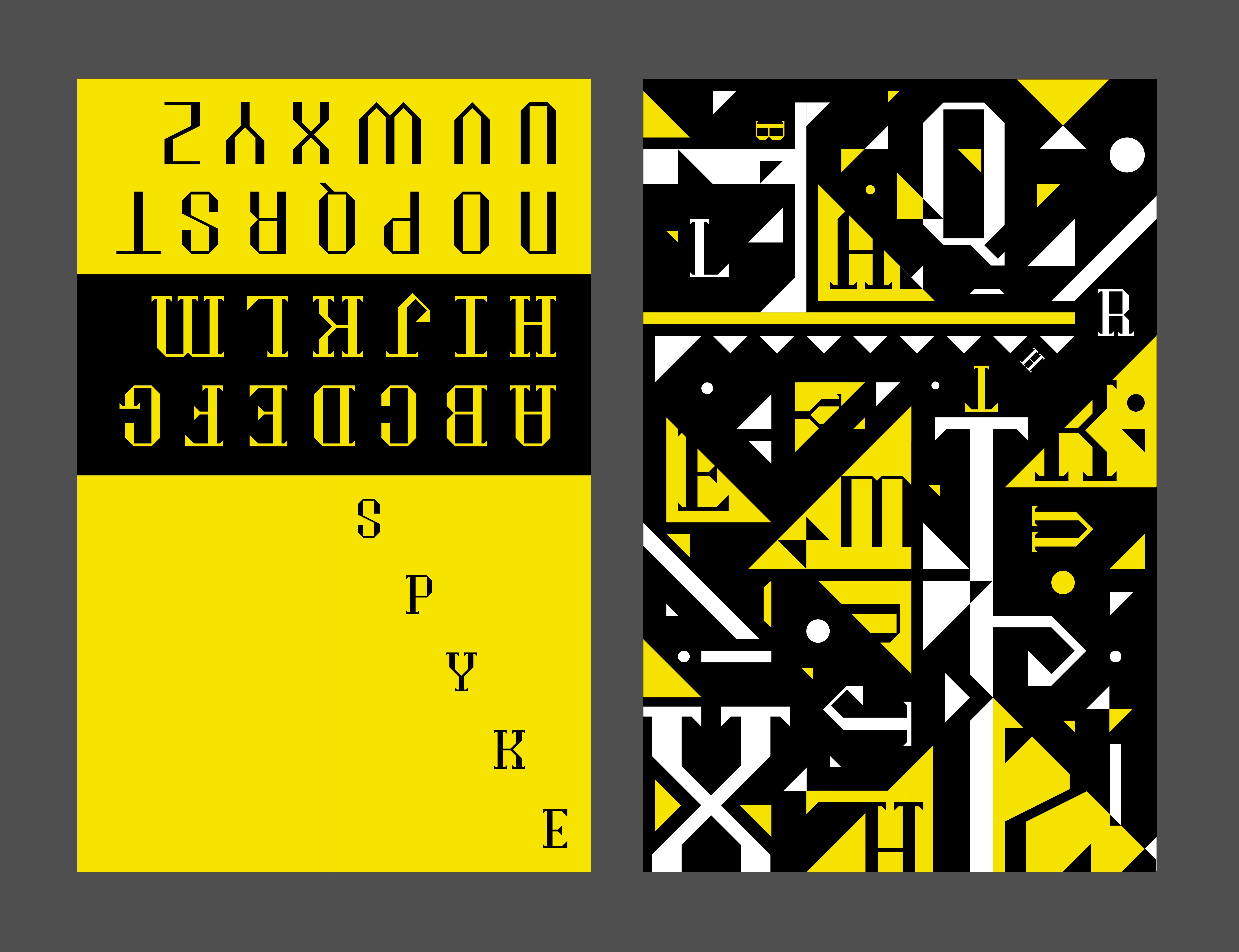
Our brief was to create a new typeface on fontstruct.com and produce a 11 x 17 inch type specimen showing off its most unique or representative characteristics.
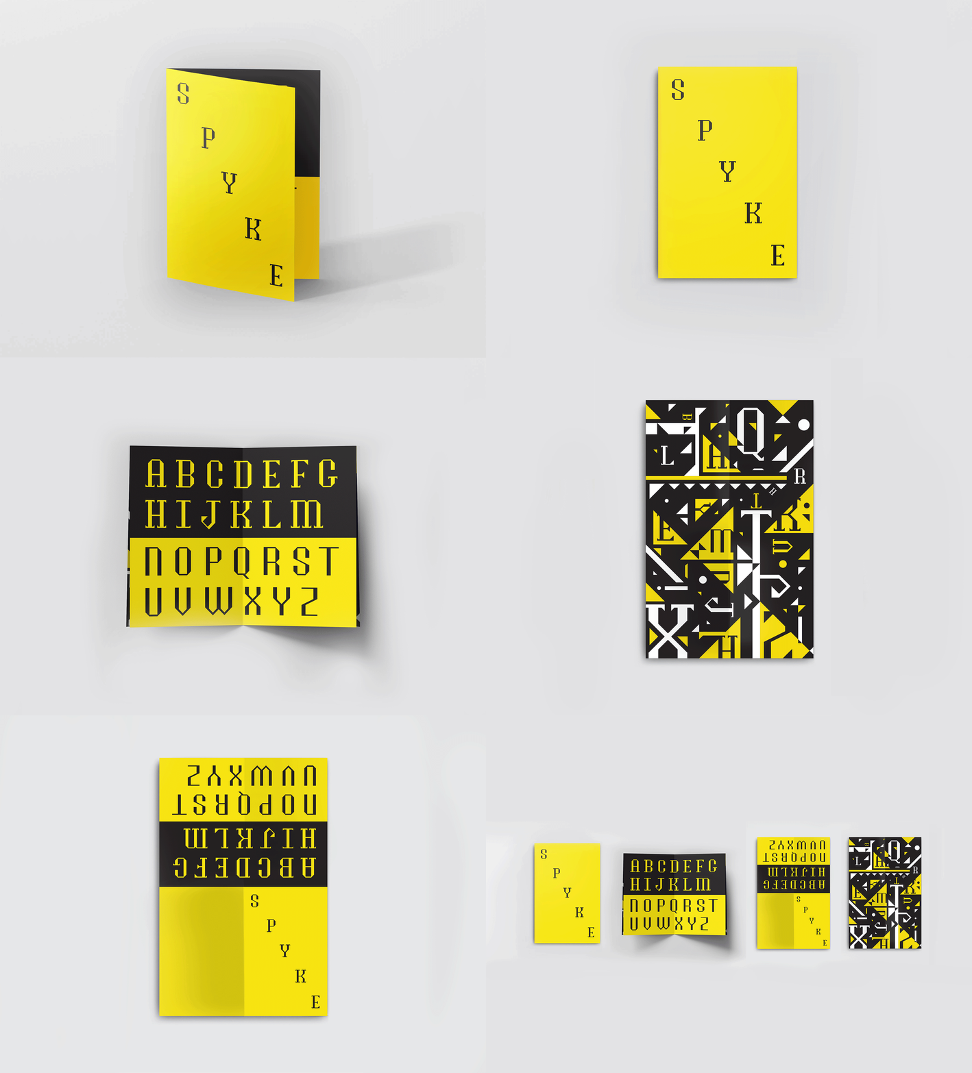
Final Design:
Design Journey:
I started off with a variety of designs, using the capital letters H, D and O since these letters
best help you figure out how key parts such as stem, bowl, crossbar or serifs (if applicable) might look.
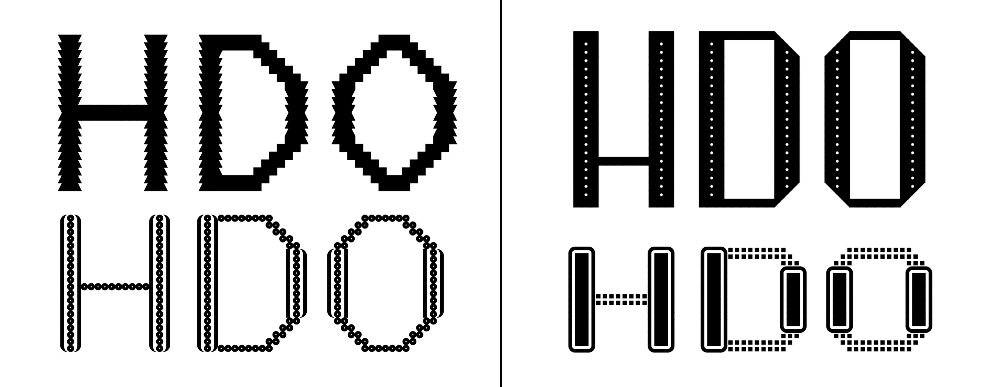
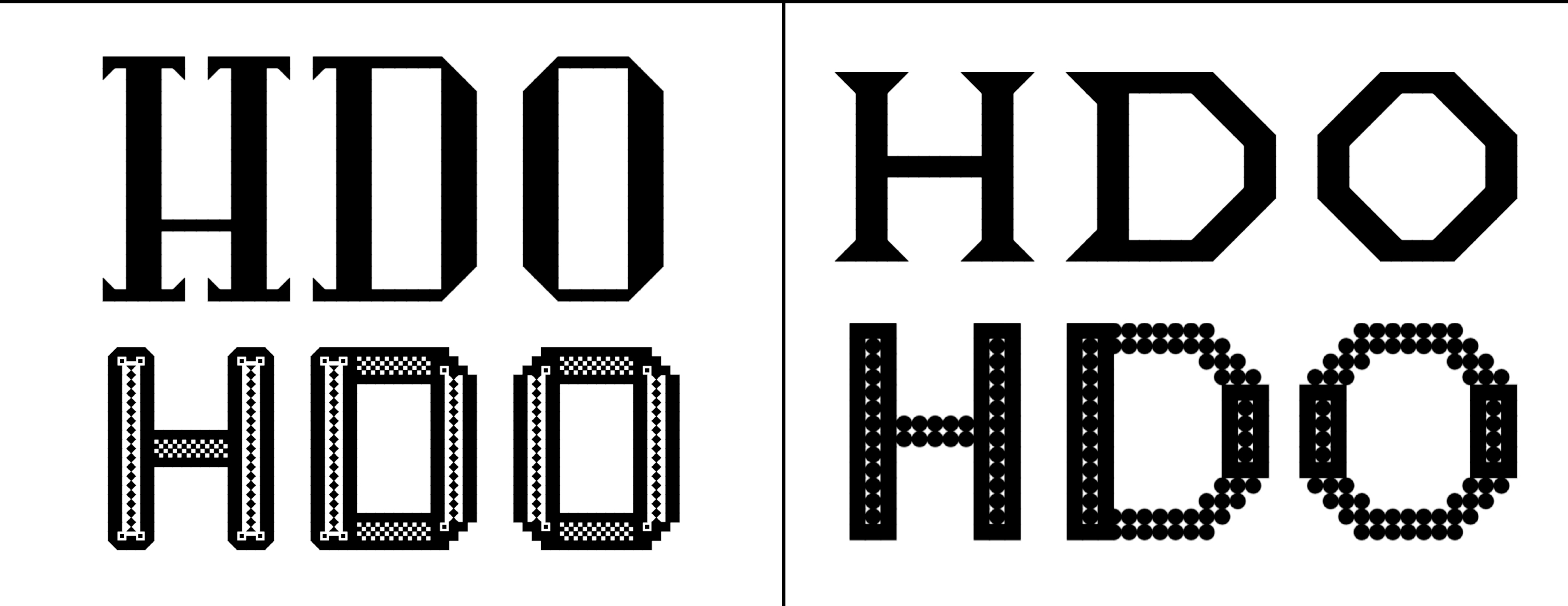
I ended up going with this one because I thought it had really interesting pointed serifs that contrasted its block-like square edges.
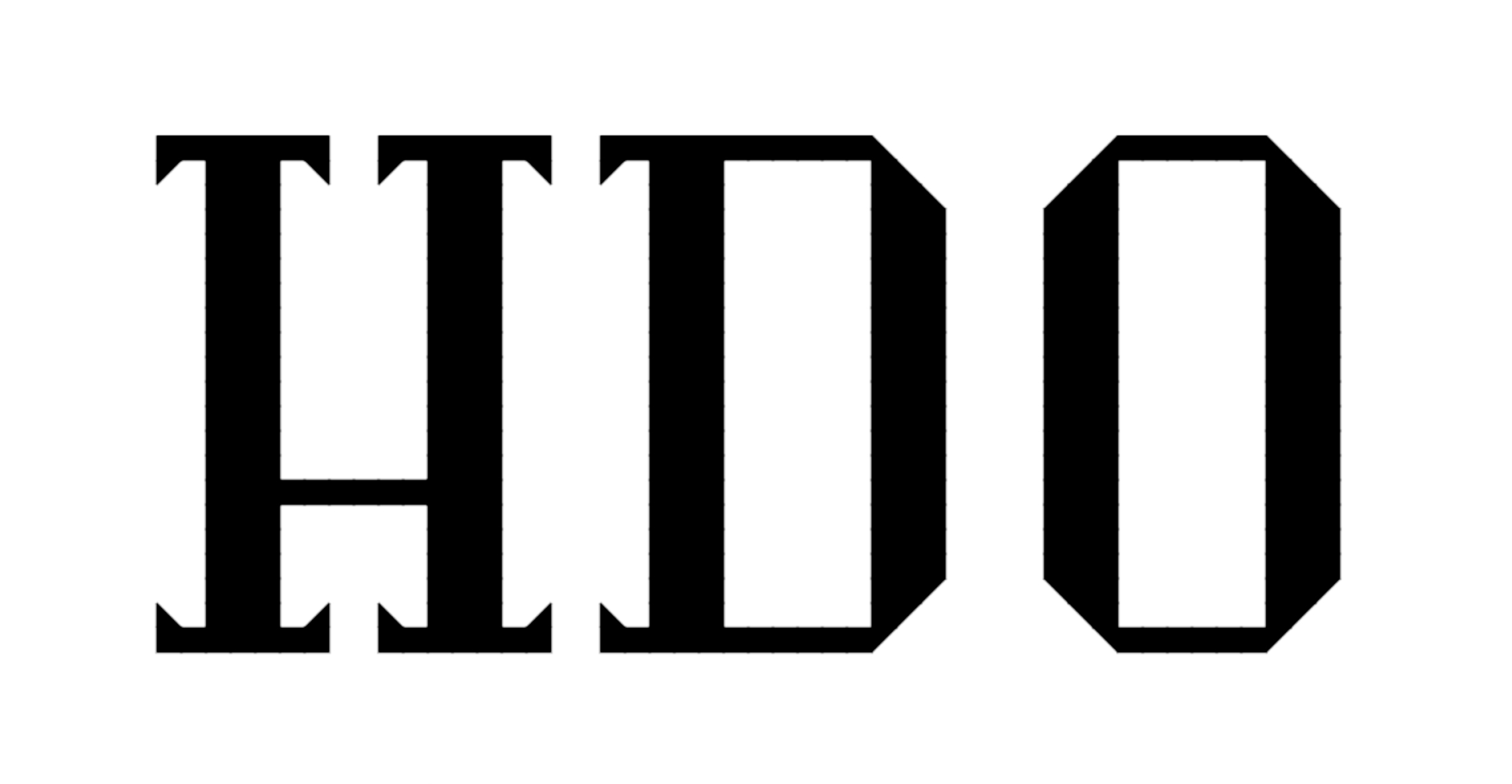
The next step was to create the entire alphabet.

After some thought, I made some tweaks on some stems and strokes.

It's hard to tell what I changed, so here's a gif. (Look at the S, X and Y)
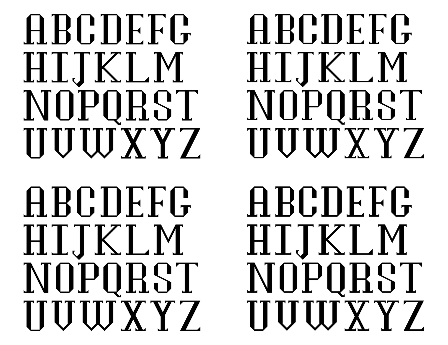
With the help of my great professor, I was able to successfully finalize my typeface alphabet.

I also made a sans-serif version, because why not?
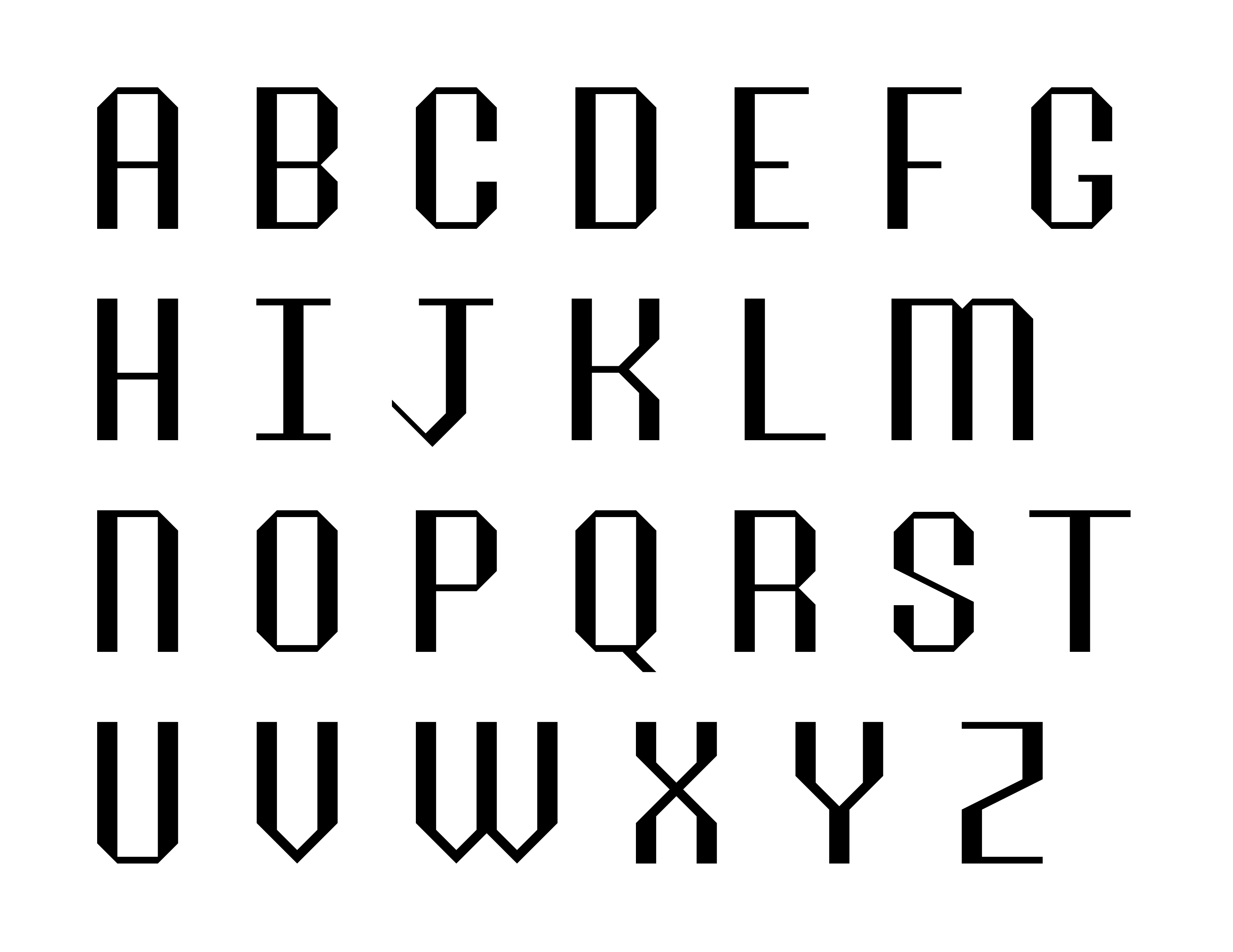
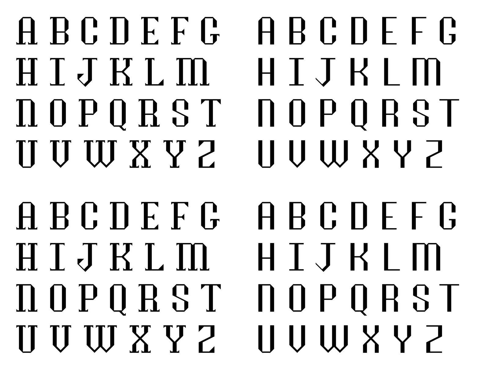
Now for the real part, it was time to start thinking of visual elements and imagery to make up for
the specimen. I made a variety of initial design sketches that I thought evoked the spikiness and jagged edges of this new
typeface, which
I named 'Spyke.' I also felt that contrasting and vivid colors such as black, white and yellow would
bring out the characteristically vivid and strong feelings a
typeface like Spyke evokes.
Since this specimen was to be a tabloid-sized sheet folded in half and half again with a cover, back, first opened spread and then full spread,
I designed elements according to the order of opening the specimen, i.e. what the viewer sees first and last from the cover
to the final full spread.
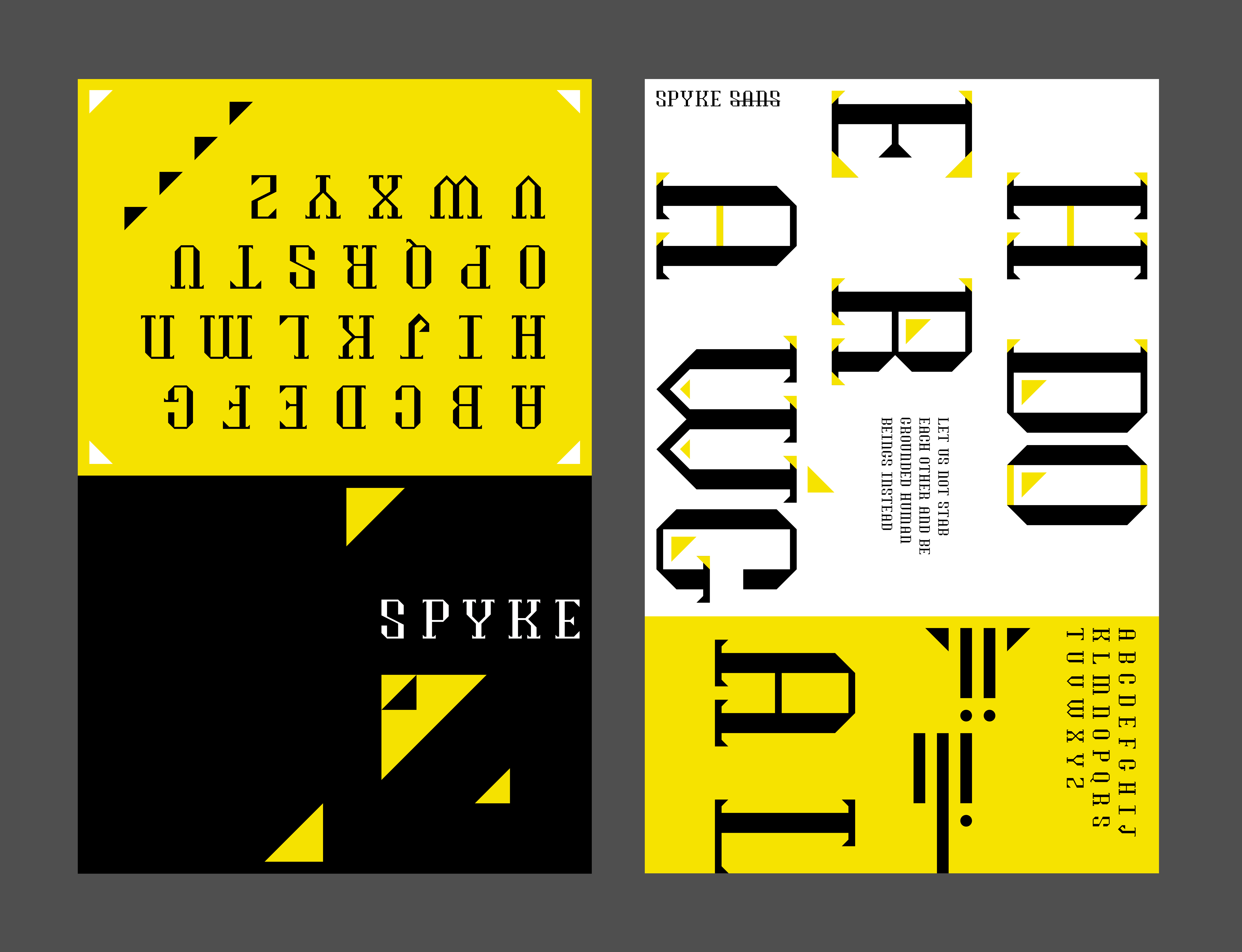
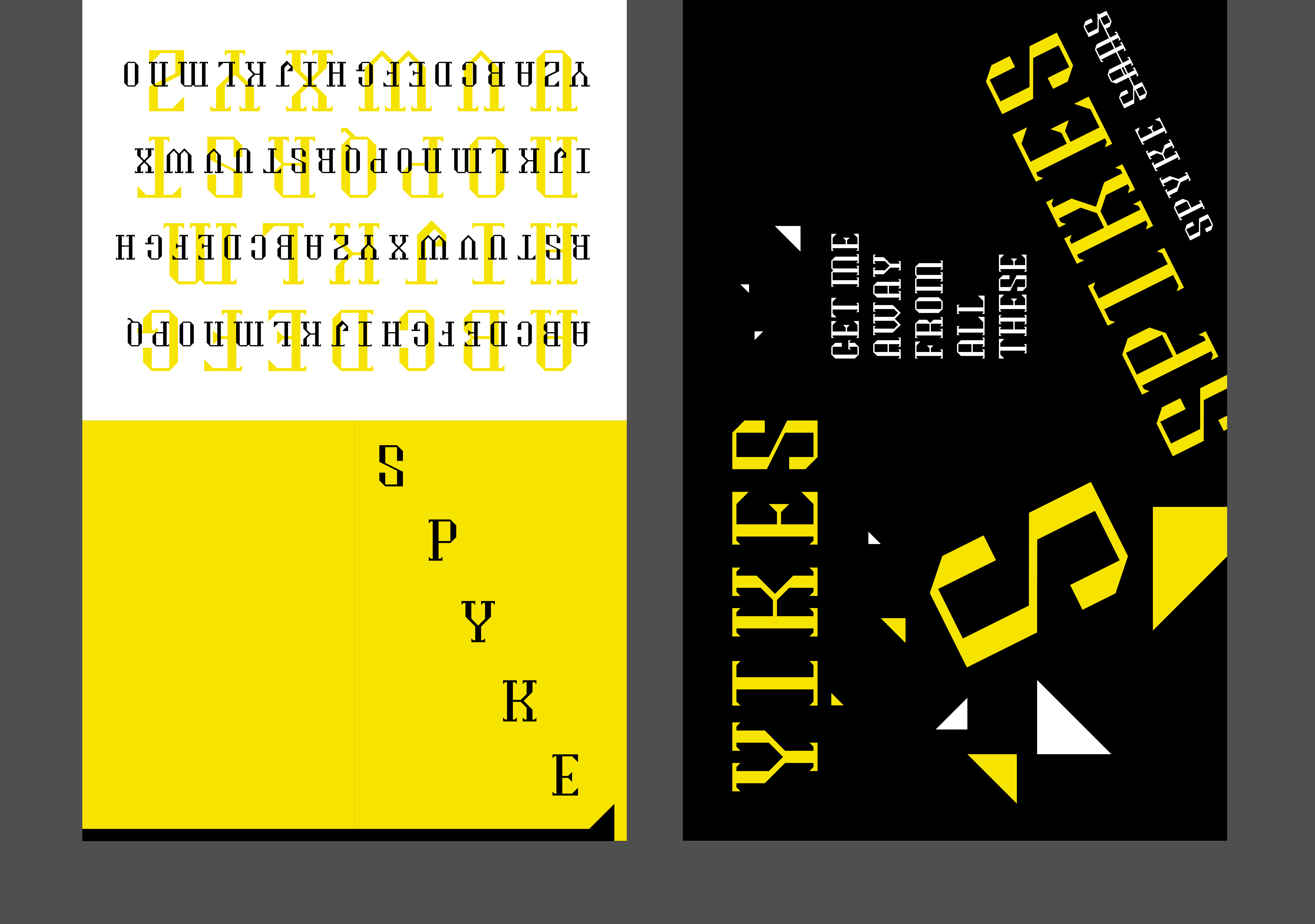
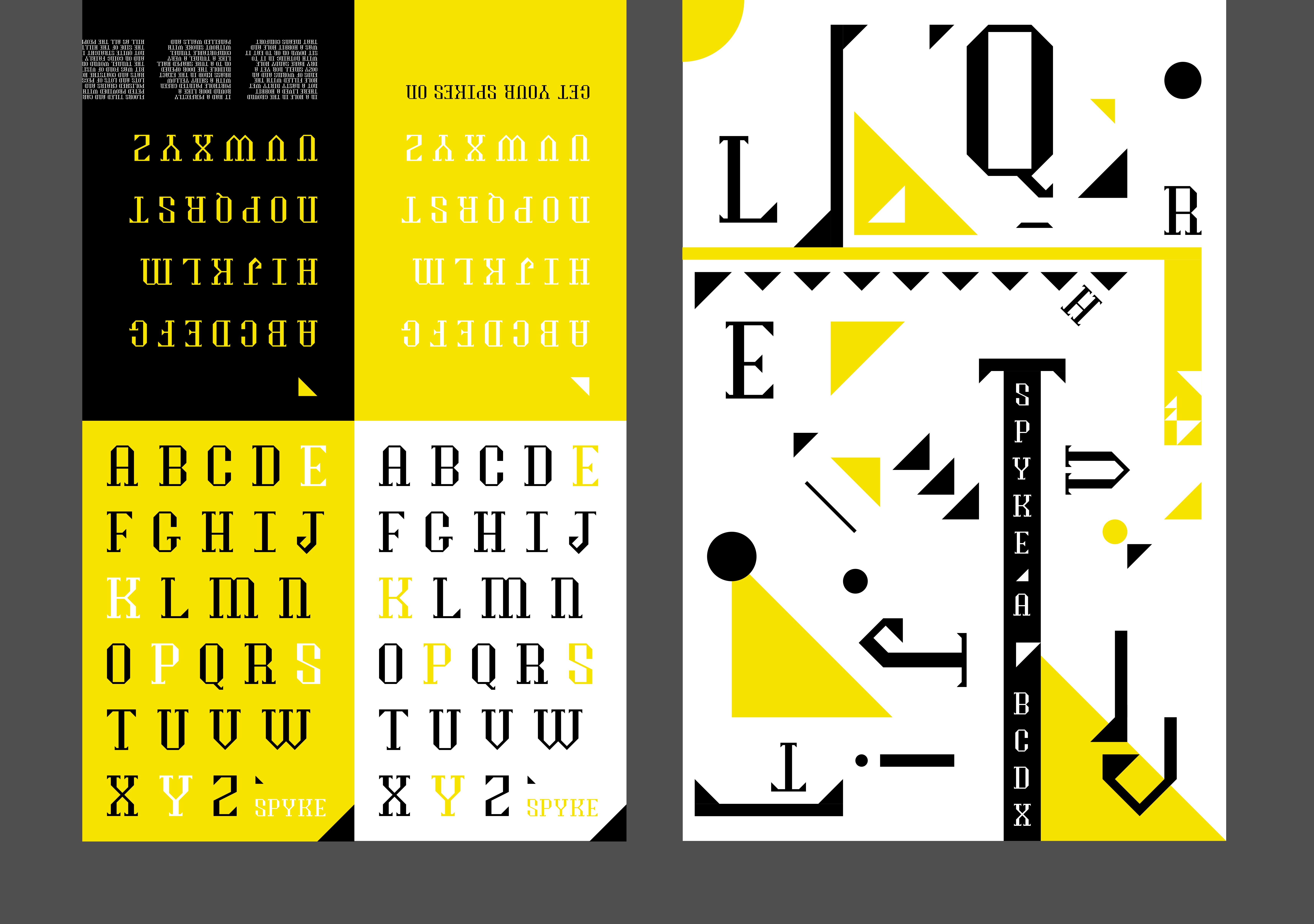
My professor and I agreed that this one on the right would be great for the full inside spread
since it really expresses the characteristic
trianglular jaggedness found in the typeface's sharp serifs.
I then thought that for such a playful yet impactful design
in the full spread, the cover and first spread should, in contrast, be more quiet and calm in order to visually strike the viewer
when
they get to see the final spread, which is why I chose the one on the left to develop as the cover and first spread.

Moving forward: I decided the cover would have the name of the typeface, the back cover would be blank,
the first spread would show the full alphabet, and the full spread would be creative and strong in its design that
evokes the sharp characteristics of Spyke.
While designing in this next part, I played around by using different colors within black, white and yellow as the main background
color.
I also wondered if I should show parts of the sans-serif version on the first spread aswell, by having half the alphabet in
serif
and the other half in sans-serif.
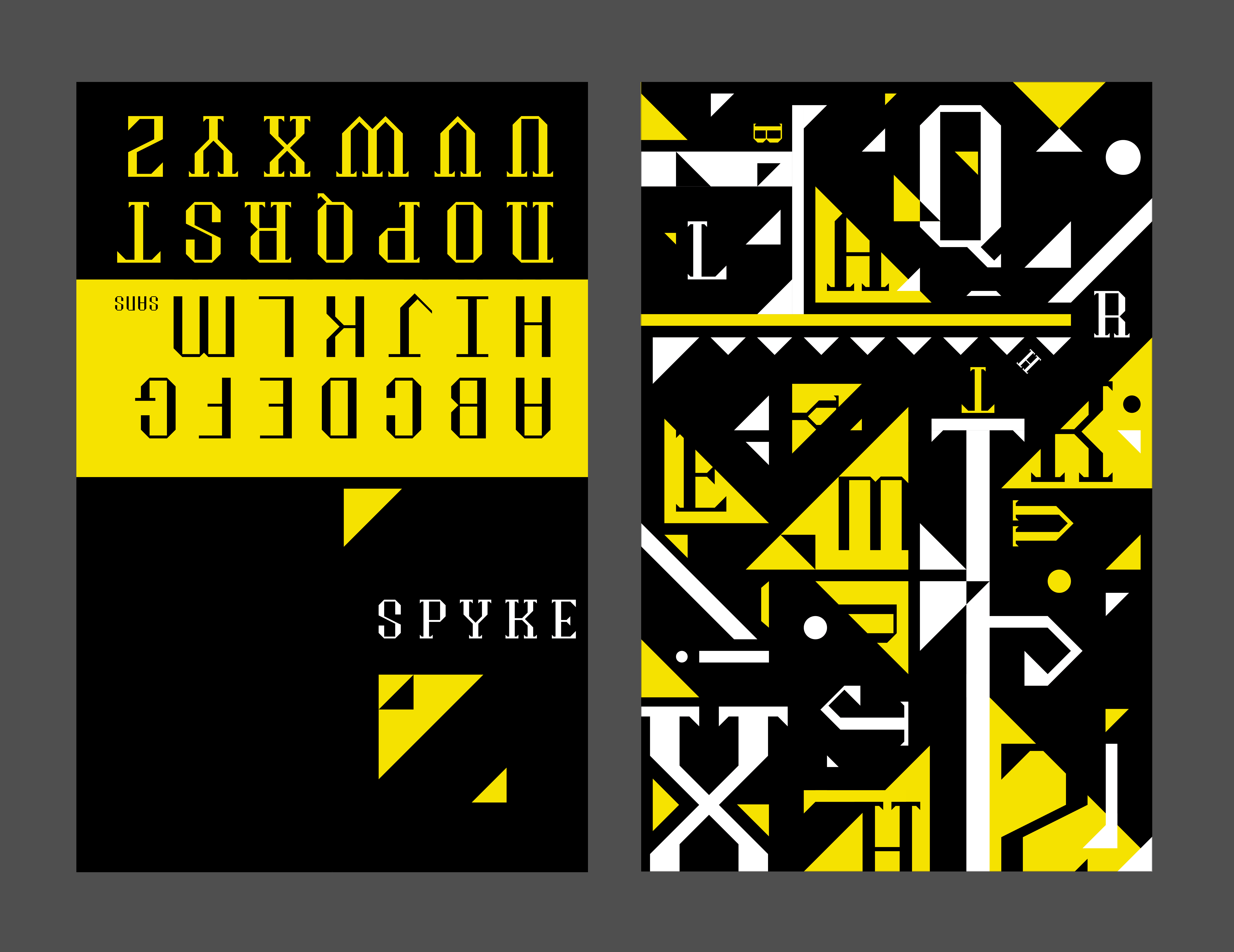

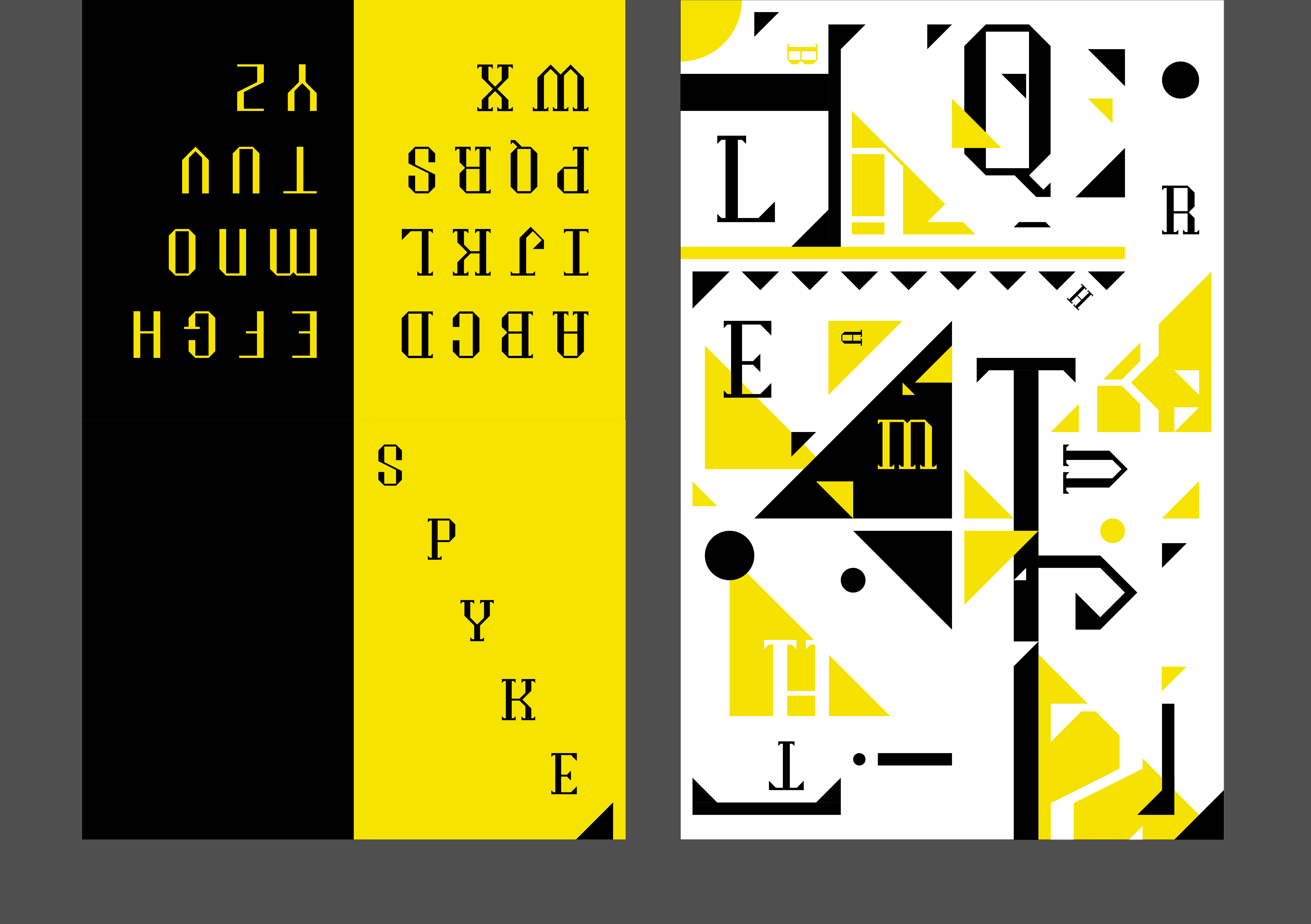
In the end, I believed the black background in the full spread was the most compelling and attractive,
and that perhaps more yellow on the cover and first spread would better compliment the abundance of black inside, since white didn't seem
vibrant and intense enough for the impact I was trying to achieve.
With some more visual tweaks here and there, I came to my final specimen design. With a simple yet arresting cover design and first spread that
shows off the two versions of Spyke, the final spread immerses the viewer in a salient sight of Spyke's unique spikes and playful edges.
Journey of developments and changes...
Printed form...
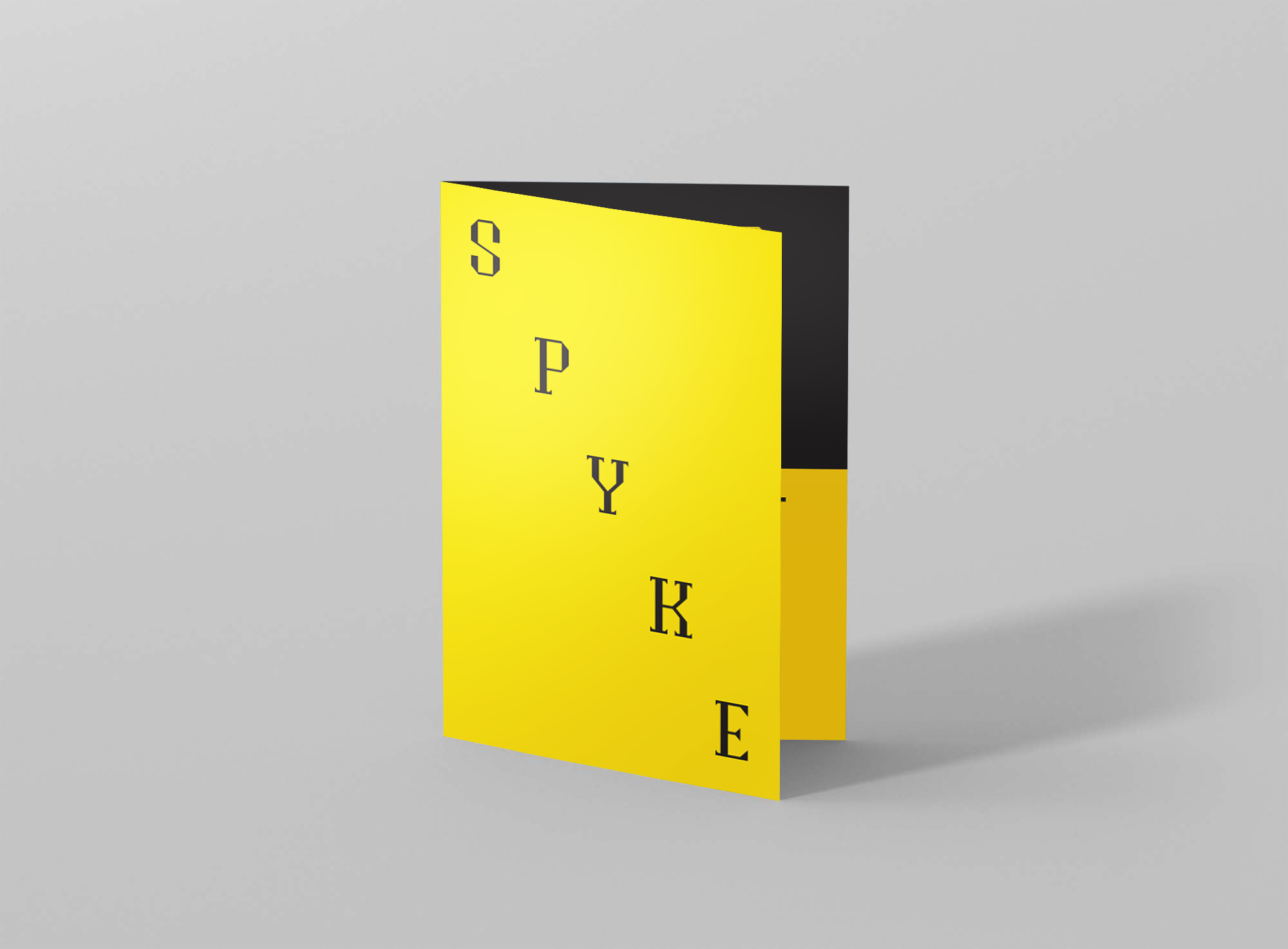
Cover.
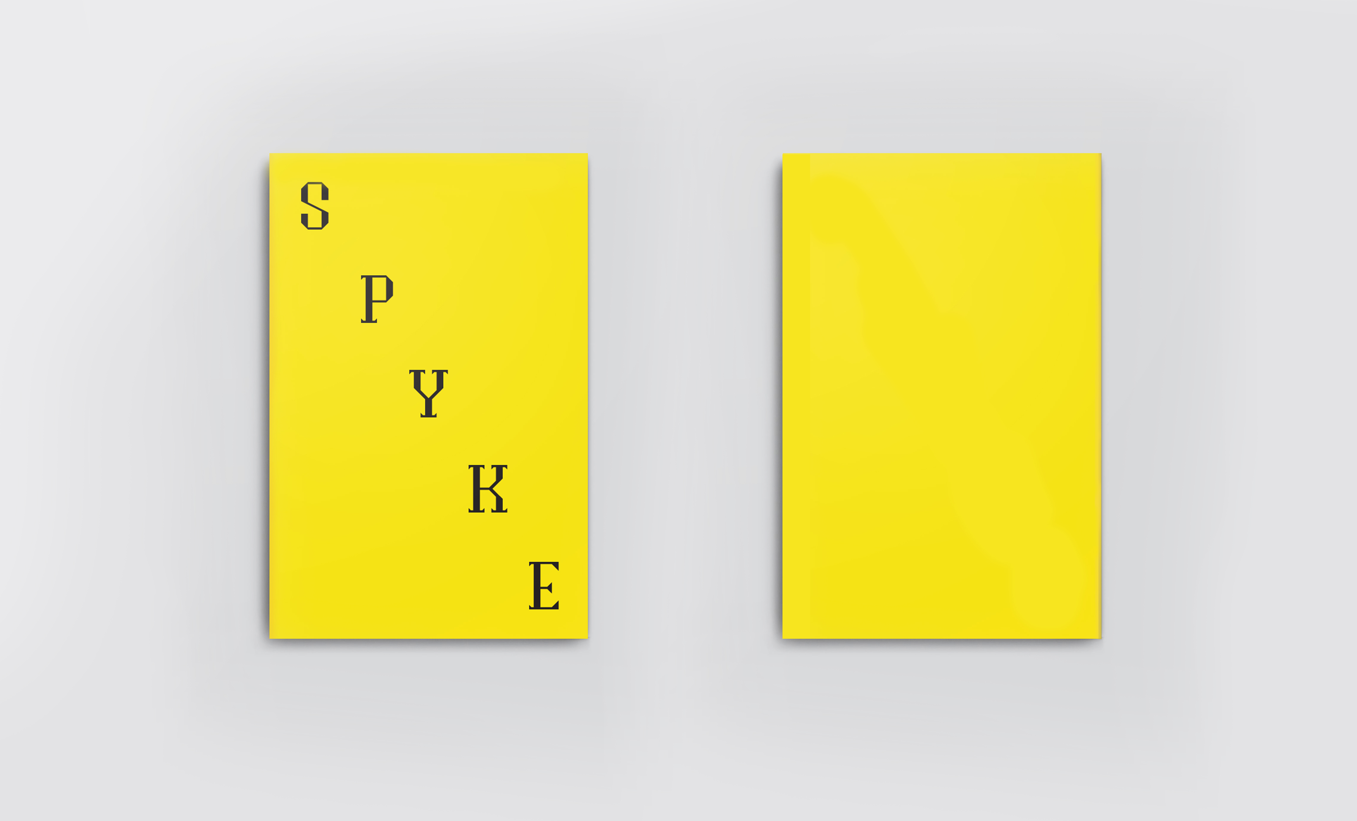
Cover and back.
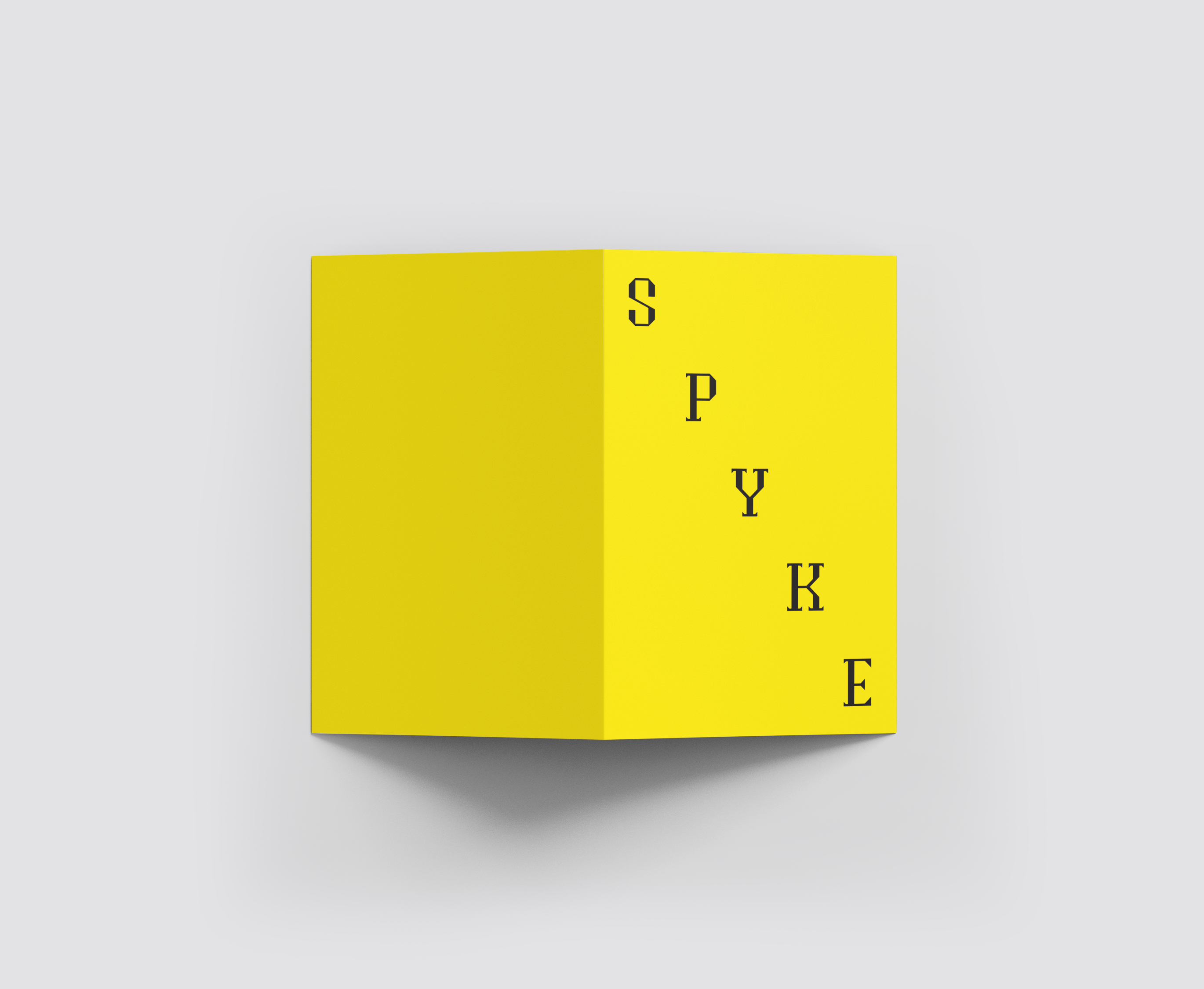
Foldout of cover and back.
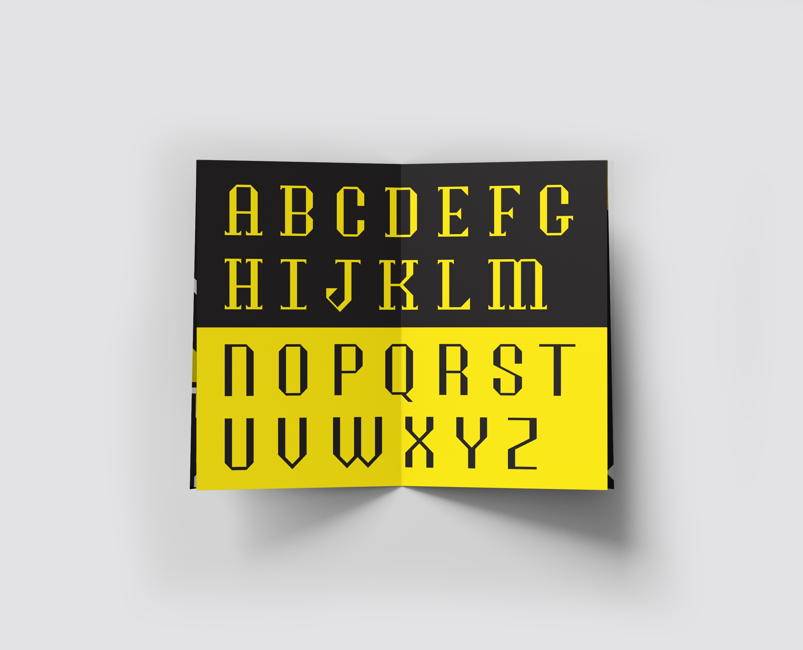
First spread.
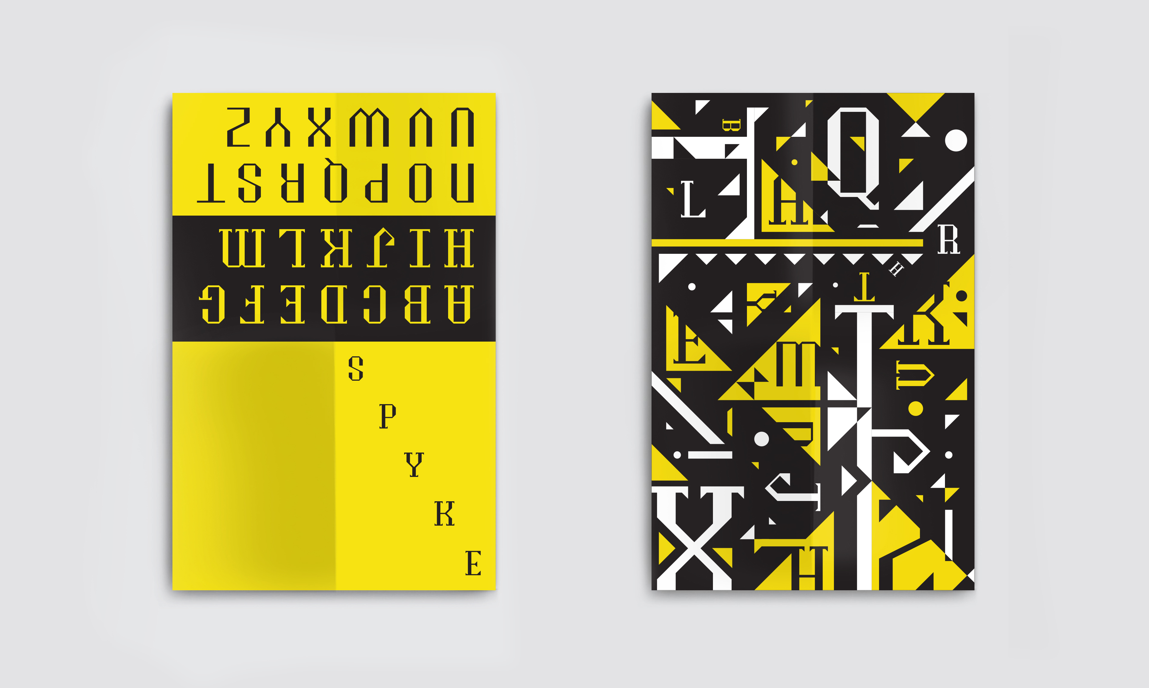
Full spreads, outside and inside.

Full spread, inside.
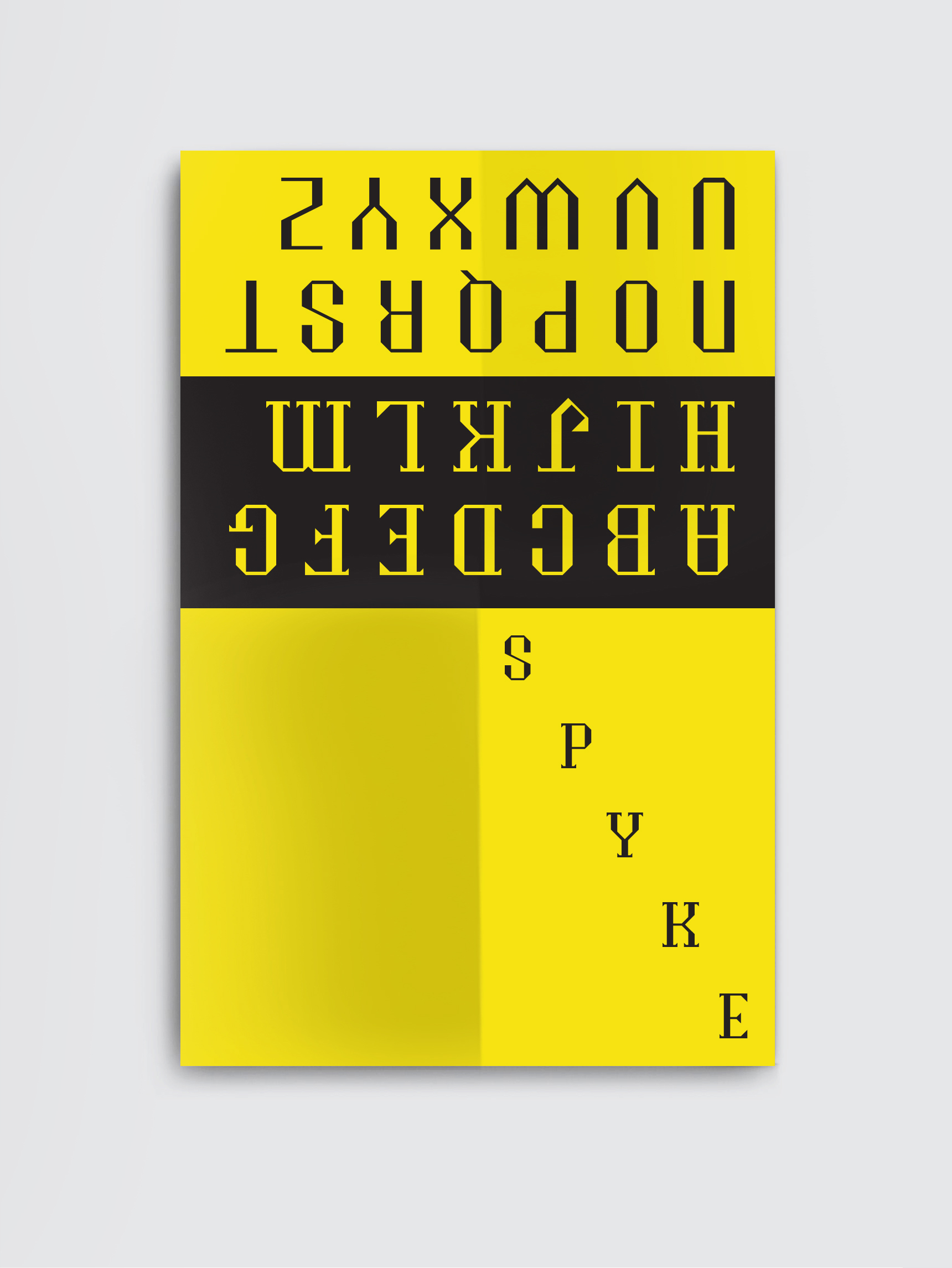
Full spread, outside.
2019 - Rue-Faye Rao - Design