

Our brief was to choose a current exhibition happening in New York, and re-create the
exhibition's identity design. I chose the exhibition, Joan Miro: Birth of the World,
held at MoMA, New York from February 24-June 15, 2019.
The identity design was to consist of a poster, brochure and wall graphics.
Final Designs:

Design Journey:
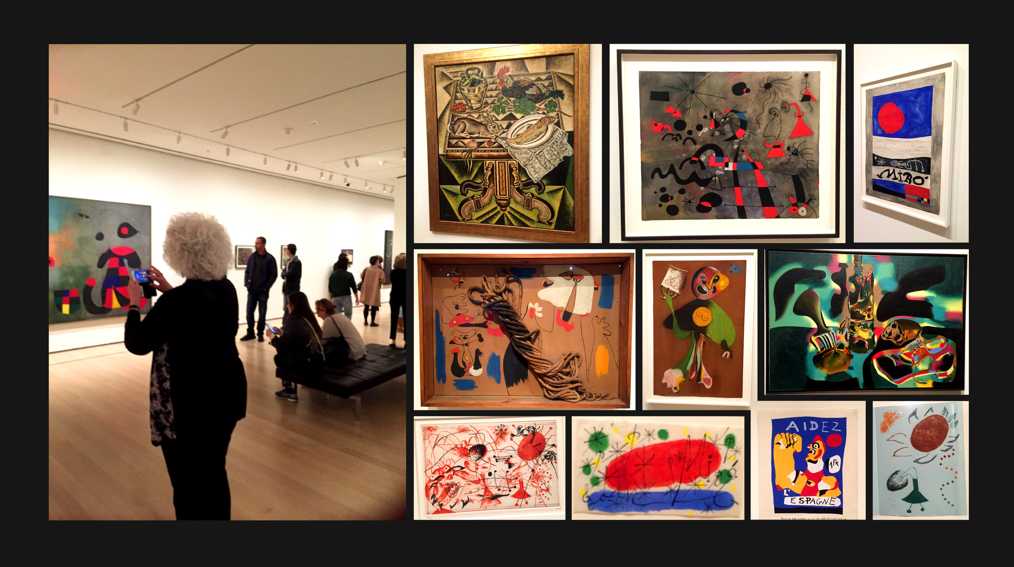
Before I started the design process, I visited the exhibition in person. This was important because I needed to understand
the overall atmosphere, lighting and space of the interior, as well as the style and implications of Miro's work itself.
Of course, I also did research on Miro's childhood and life as an artist.
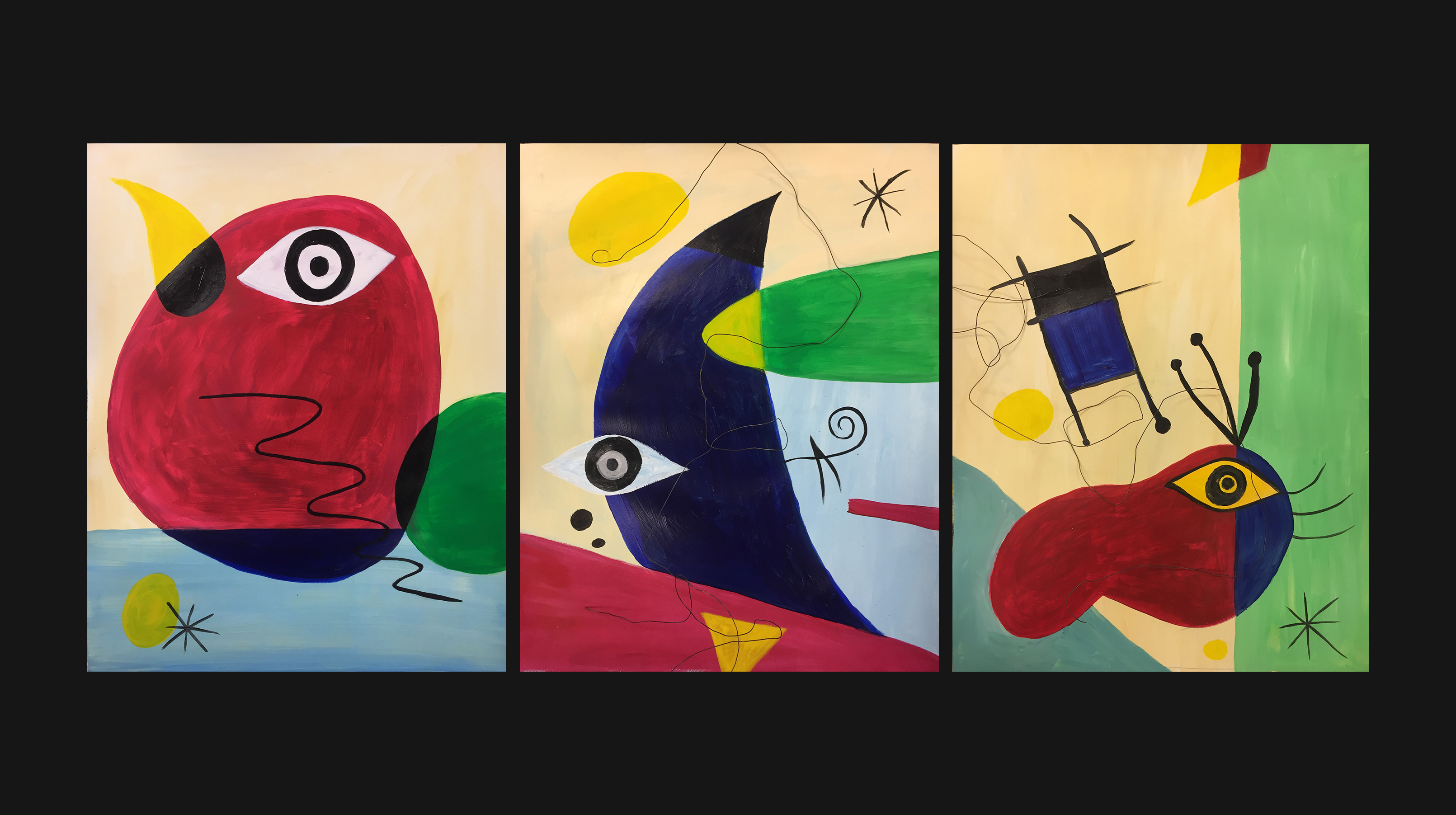
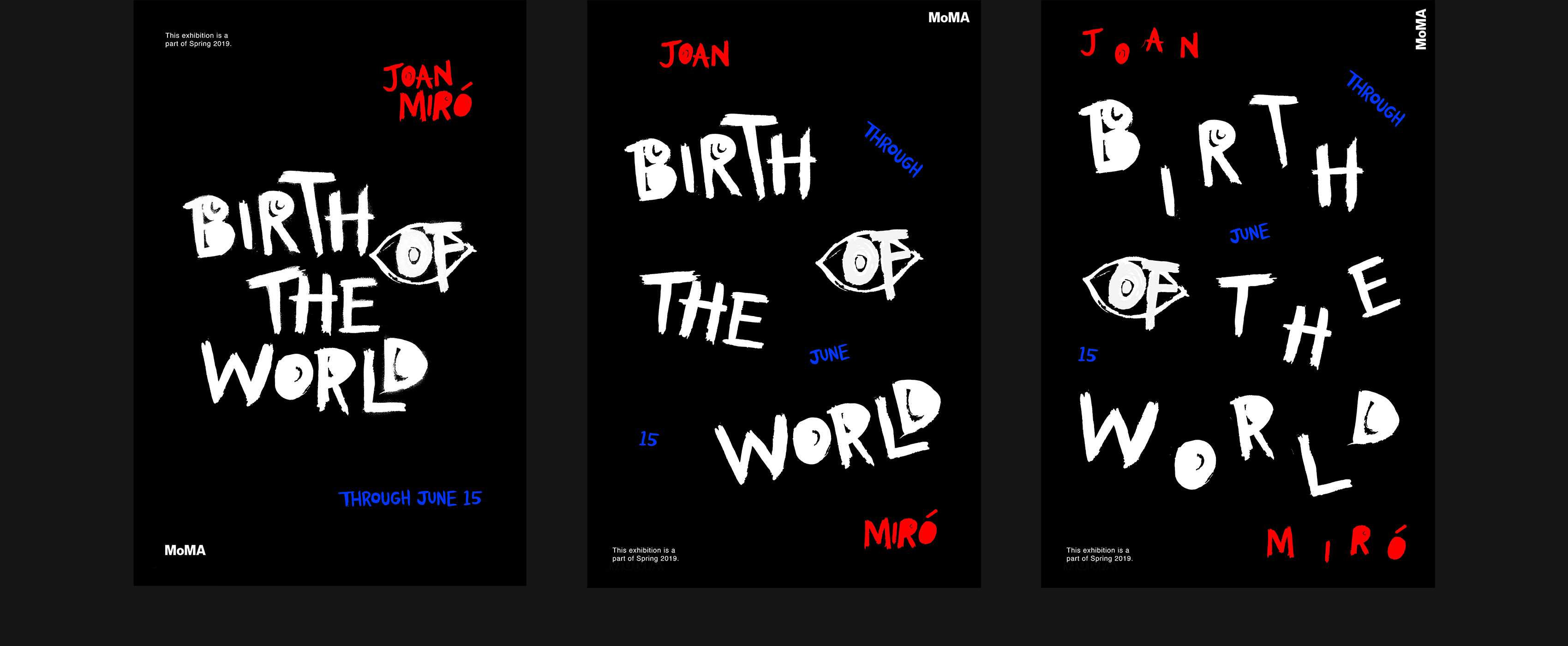
I then started creating some of my own imagery for a possible poster with paint that inspired me from his varieties of paintings, and generated some organic hand-lettered type I thought complimented the hand-painted imagery.
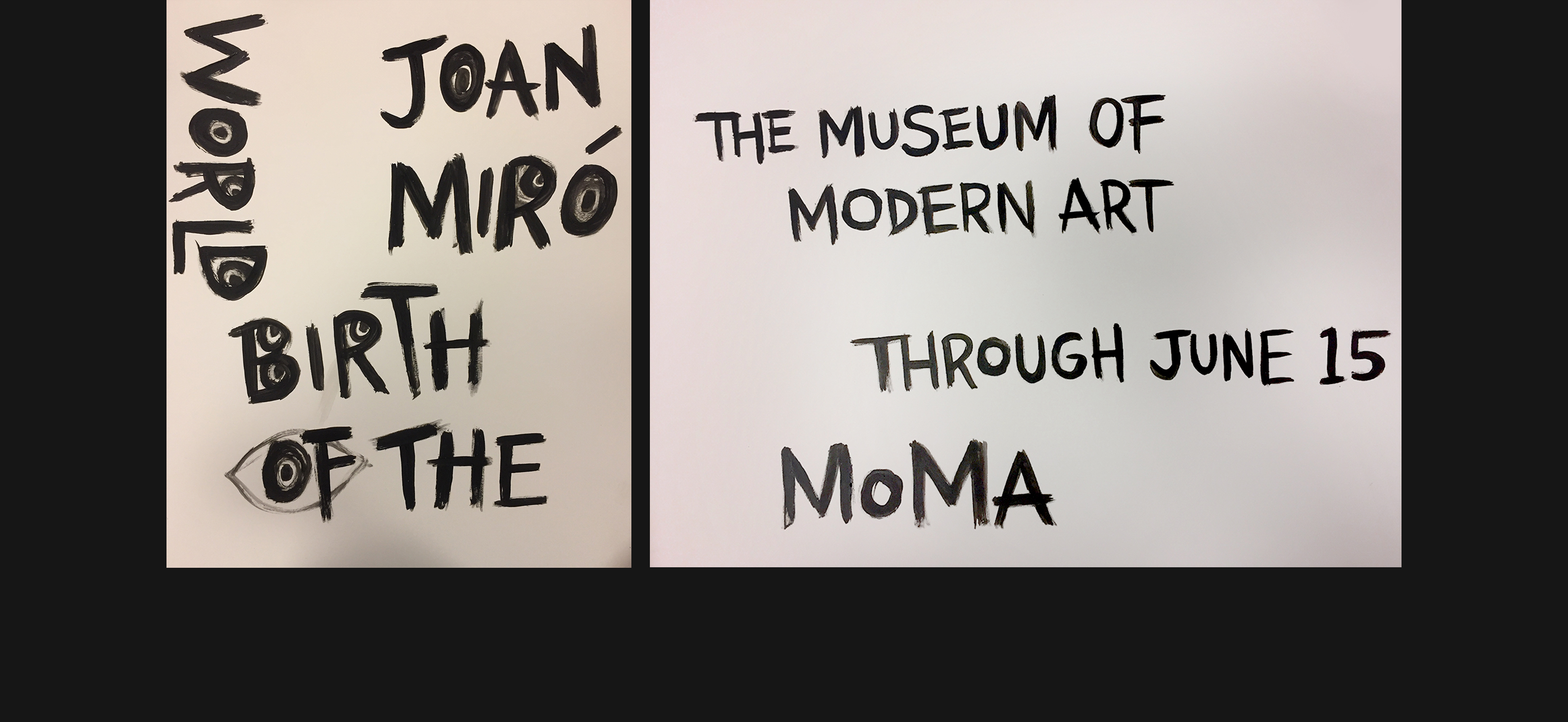
With these, I moved onto the computer and played around with color and size to form poster concepts.
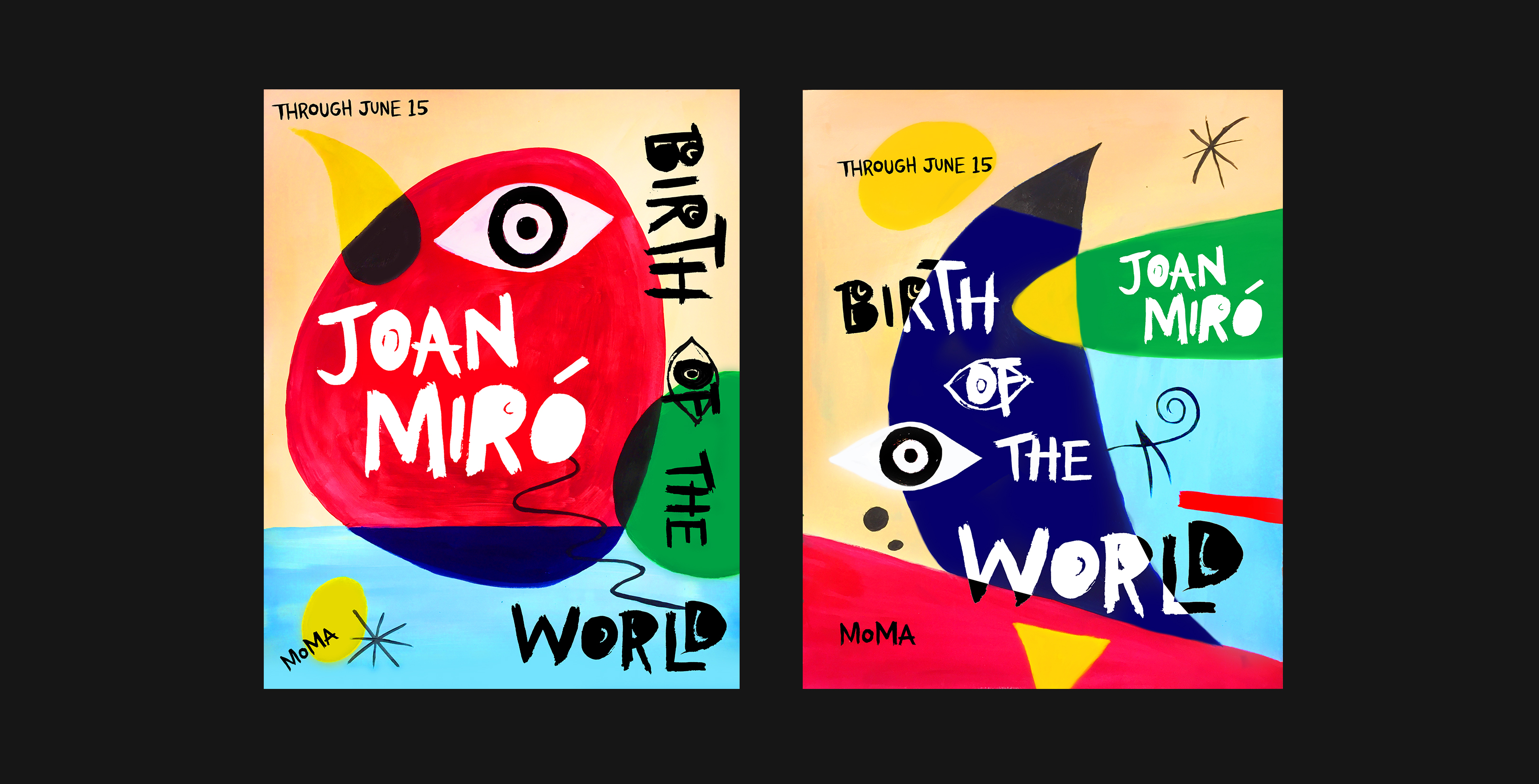
While it was okay to integrate art, the posters seemed too much like art, and not design, because
rather than
implying the essence Miro and the exhibition, they were embodying Miro's art itself.
I decided experiment around by creating imagery with type, then with color, to find
what could work instead.
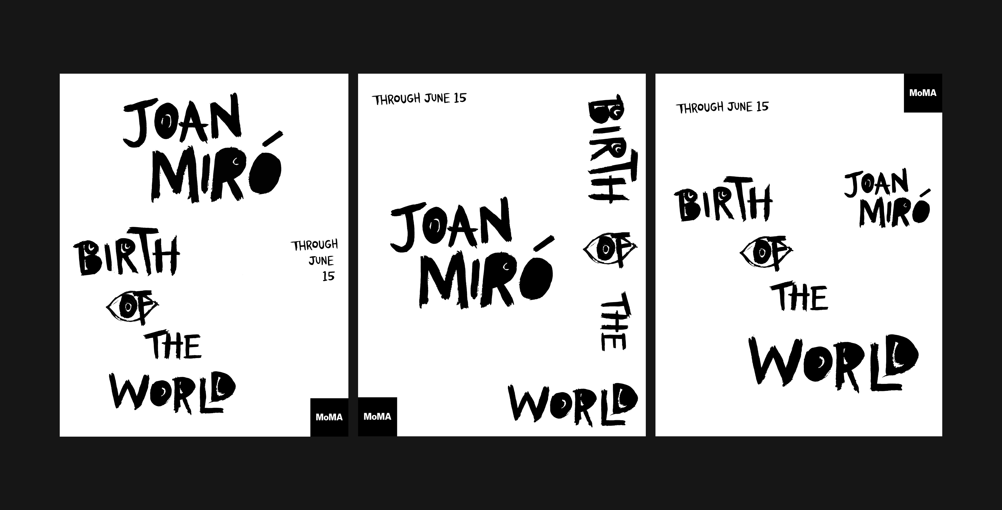
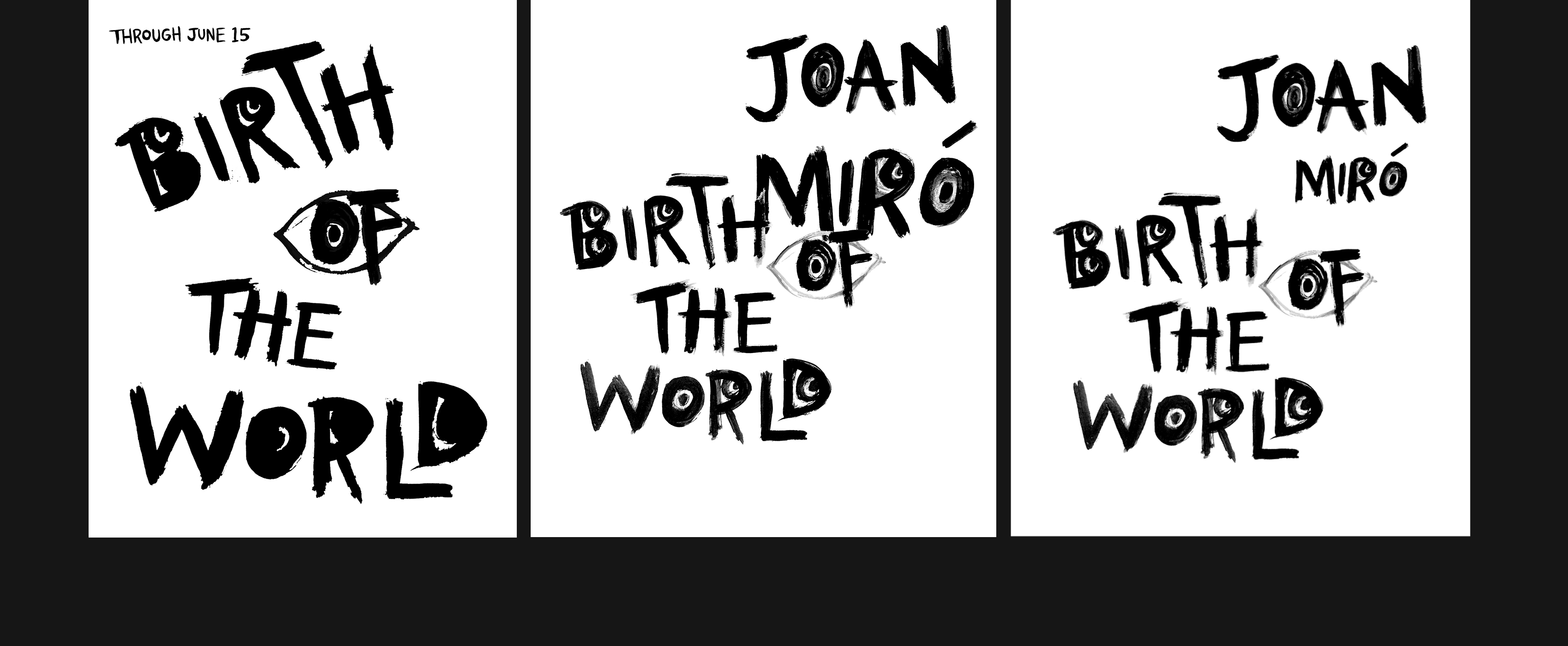
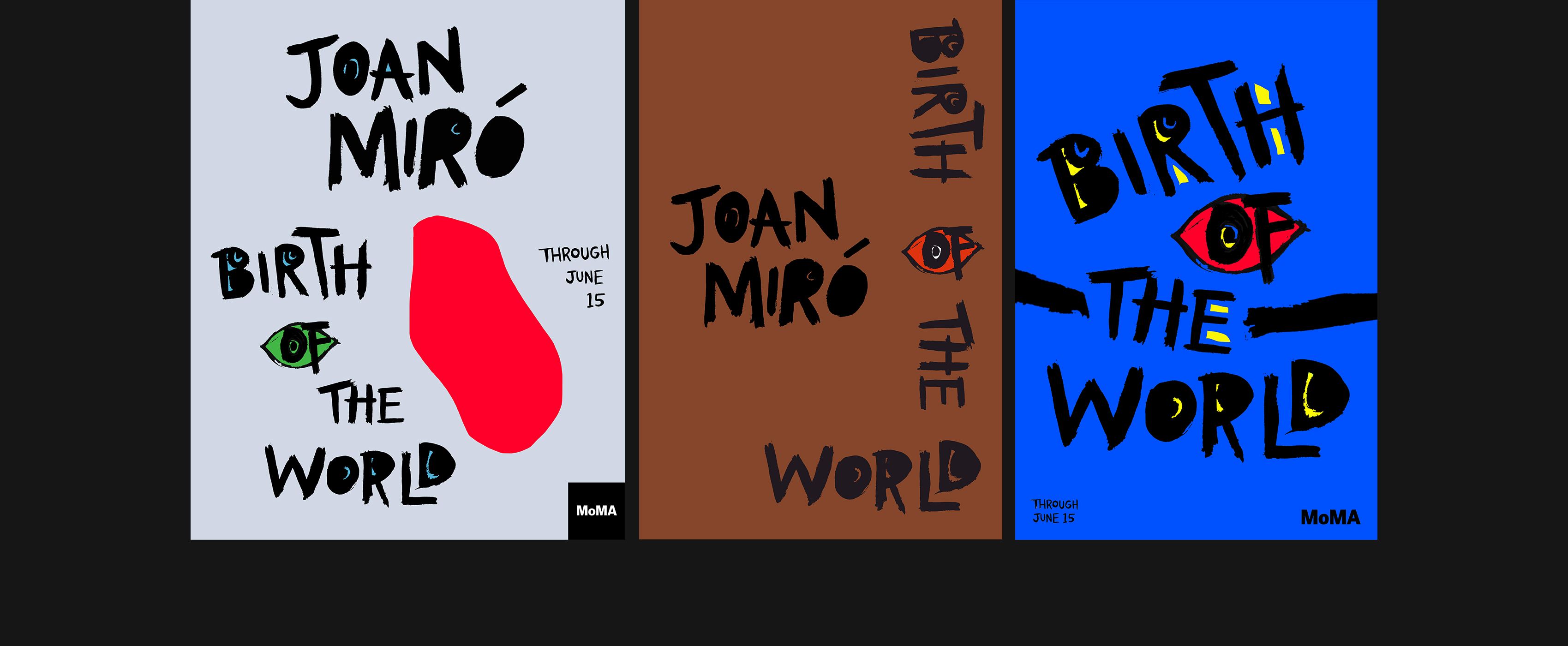
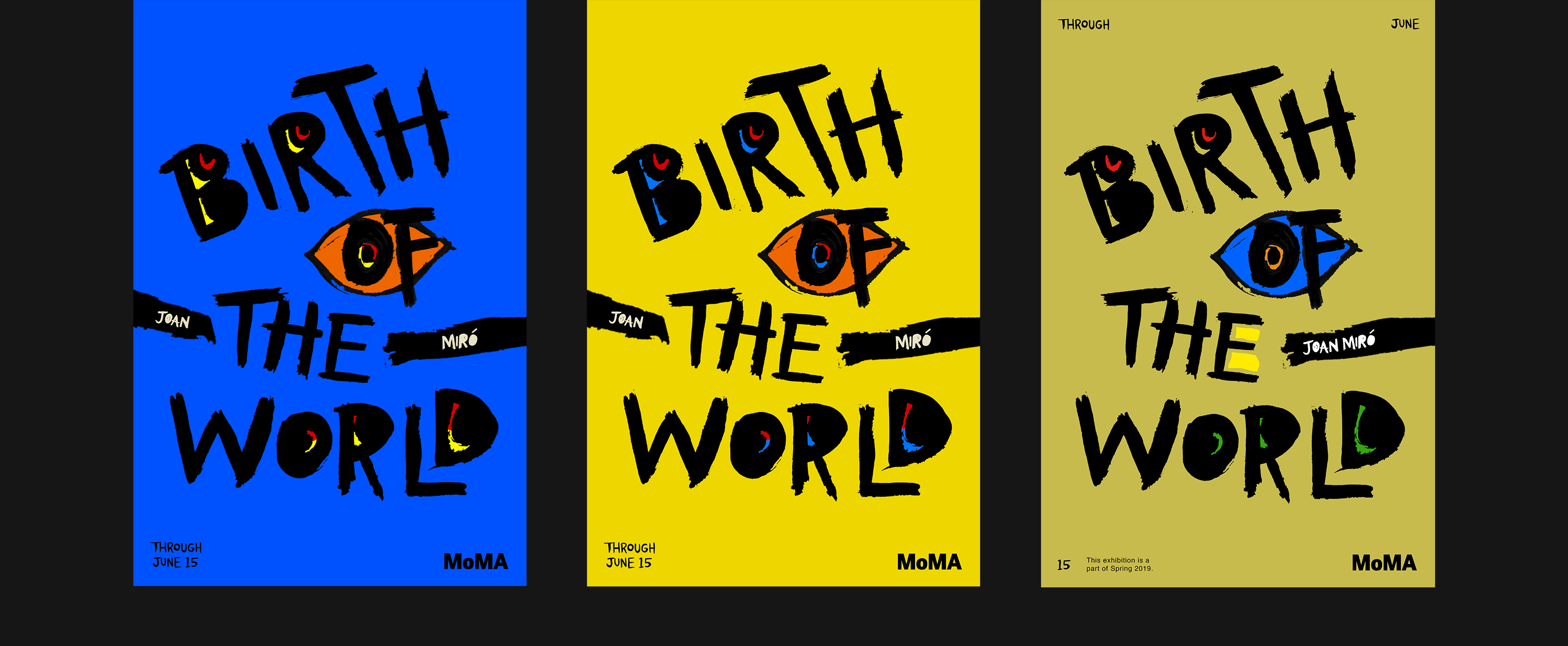

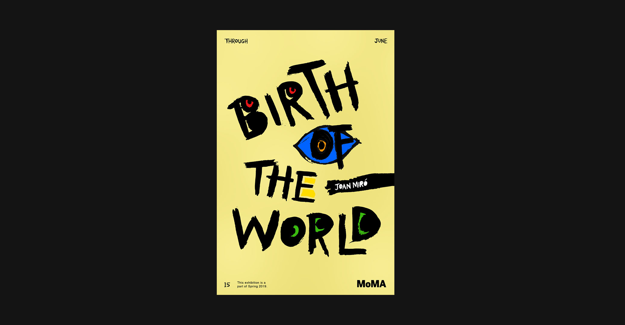
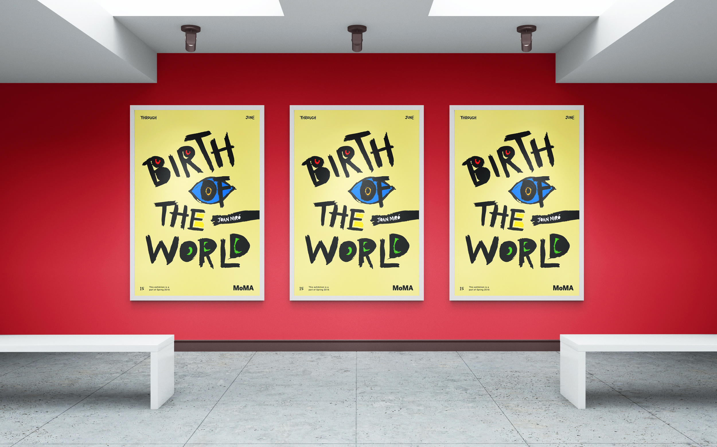
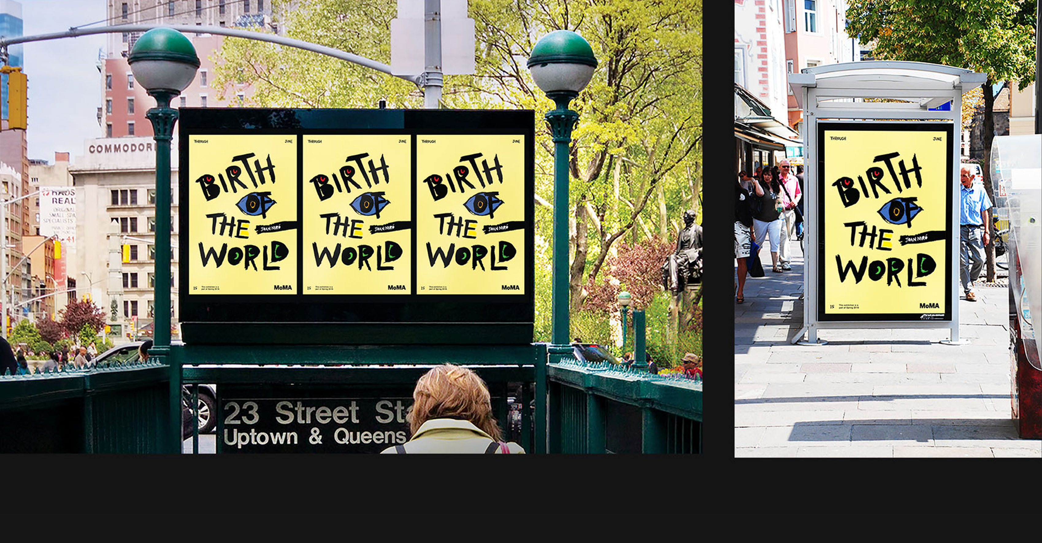
In the end, I came to this final poster after deciding it was the best at evoking Miro's
artistically surreal qualities and colorful imagery, yet succeeded in not appearing as if it's a replica of one
of his works.
It includes the name of the exhibition 'Birth of the World,' the artist's name 'Joan Miro,' the date of the exhibition 'through June 15' with 'this exhibition is a part of Spring 2019,' and MoMA's logo.
Brochure -
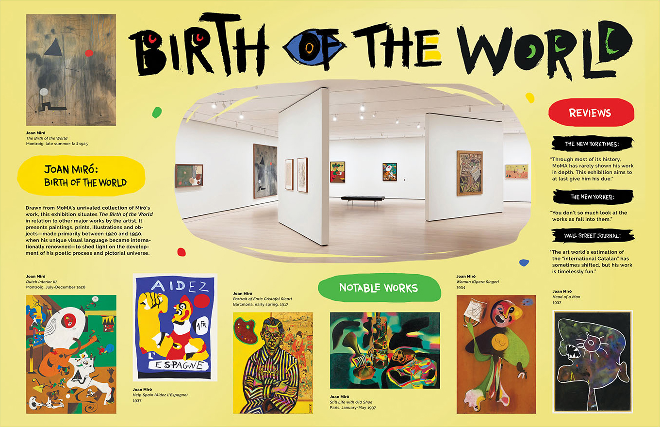
I designed the brochure according to the design of the poster, using the same faint yellow as the poster for the inside spread,
and black for the cover for contrast and to match the black lettering of the title of the exhibition.
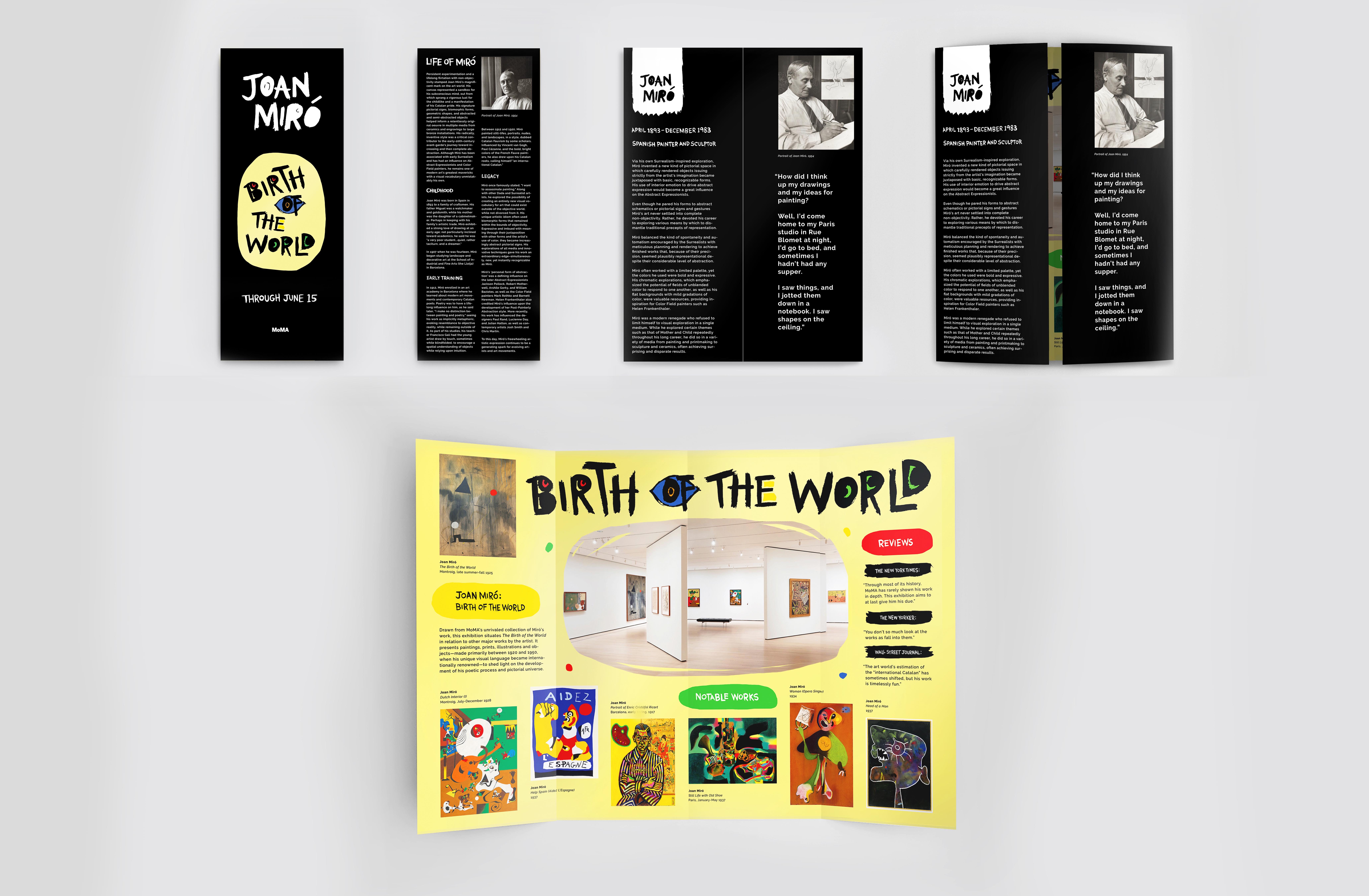
Top - Cover (cover, back cover, first half-opened spread)
Bottom - Inside spread.
The cover focuses on providing in-depth information about the artist, because I believe you can't truly appreciate his work, or any other artists for that matter, without understanding who they are, how they grew up, how and why they become artists, the messages they want to express in their work, and maybe the influences that impact the way their art is made. So, with that in mind, other than essential information such as the title and date of the exhibition on the cover, I decided I wanted visitors to be able to read about Miro's childhood, early training days and the general legacy he's left with the art world today on the back cover. Then, on the first half-opened spread, you can read a detailed overview of his work along with a prominent quote I thought could really let the reader understand Miro's artist mind.
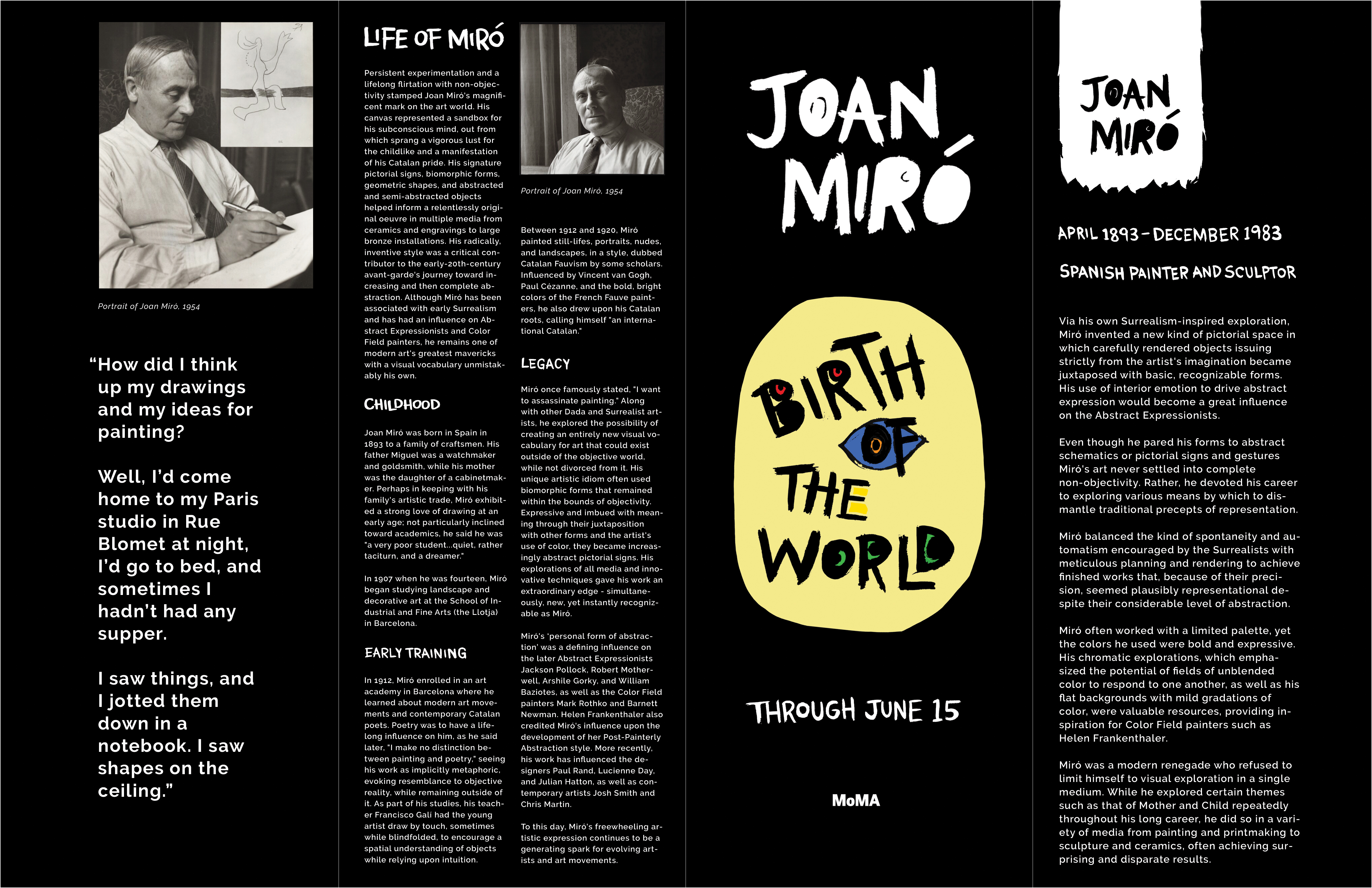
The inside spread focuses on providing information about the exhibition itself. It includes a snapshot of the exhibition space in the center, Miro's representative work 'Birth of the World' on the left, the institutions's own short description of the exhibition below it, some of his other notable works present at the exhibition along the bottom, and some positive reviews of the exhibition written by well-known organizations.
Wall graphics -
I tried a variety of initial concepts, then translated them onto an actual wall for the final wall graphics design. I mainly focused on
creating a consistent design language with the poster and brochure yet making it slightly different and more playful at the same time,
since Miro's work also embodies this kind of bold and colorful playfulness that was more difficult to express in the poster for its need
to be easy to read and simplistically powerful in order to attract attention, and the brochure for its need to focus on informing the viewers
about Miro and the exhibition.
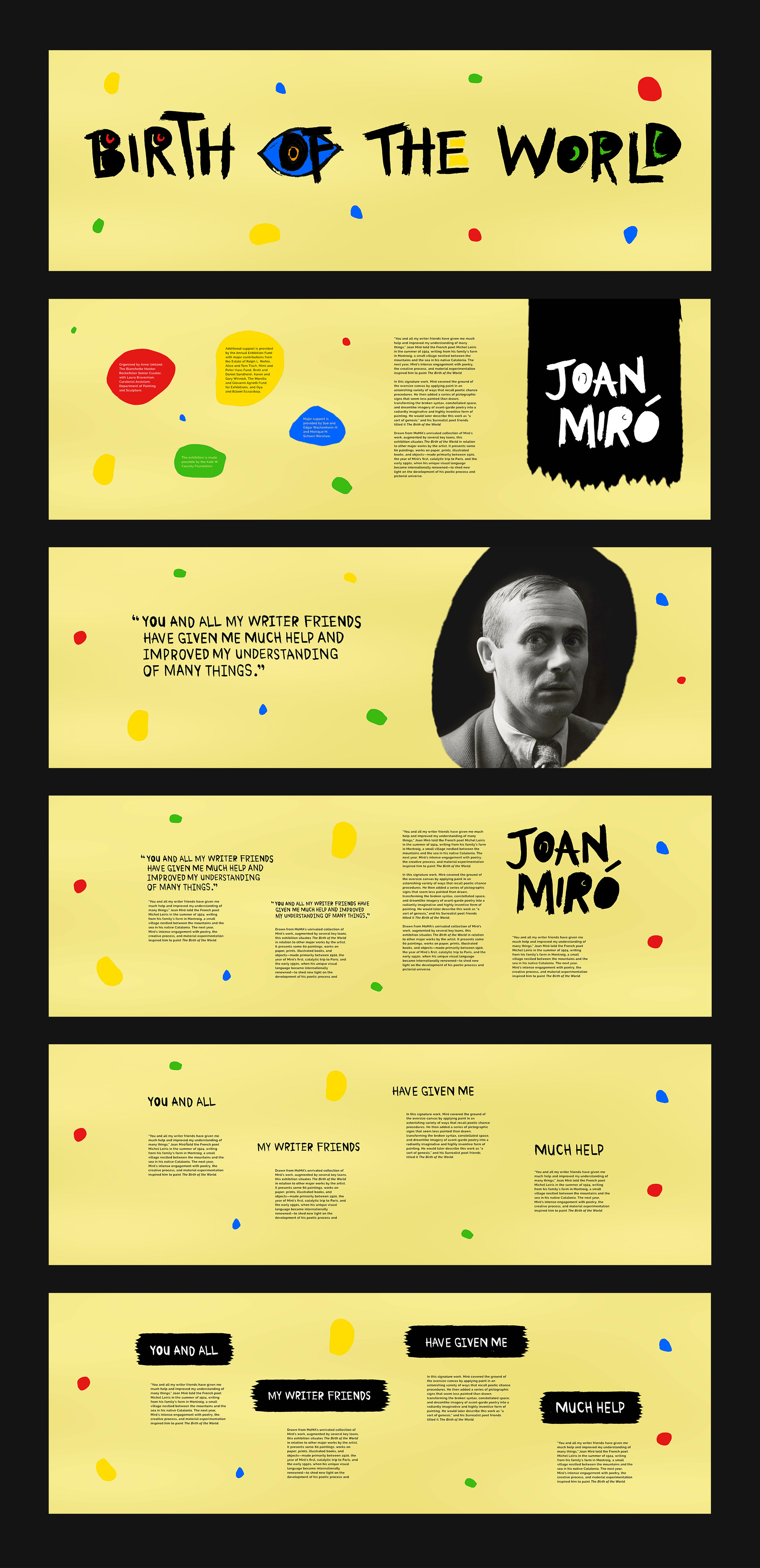
Concepts.
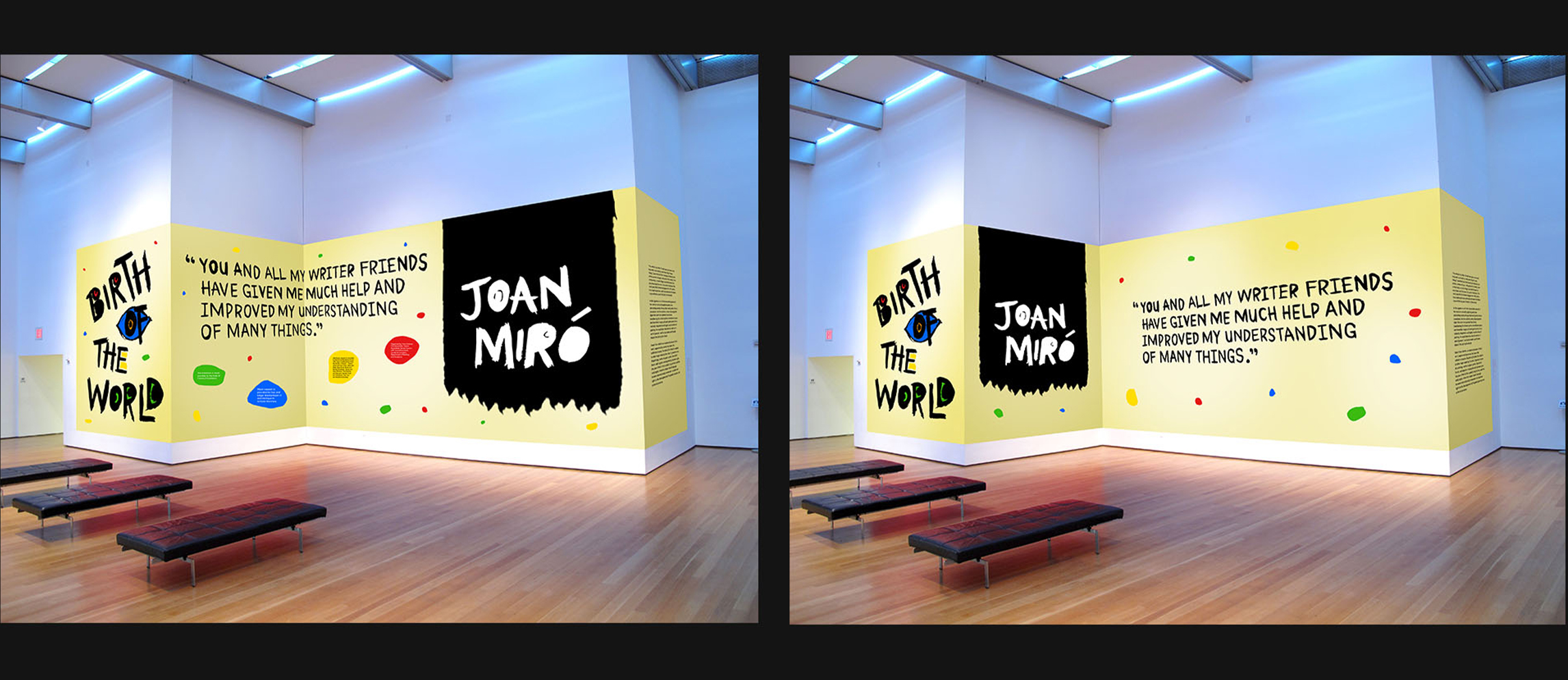
Final wall graphics - variation 1 and 2.
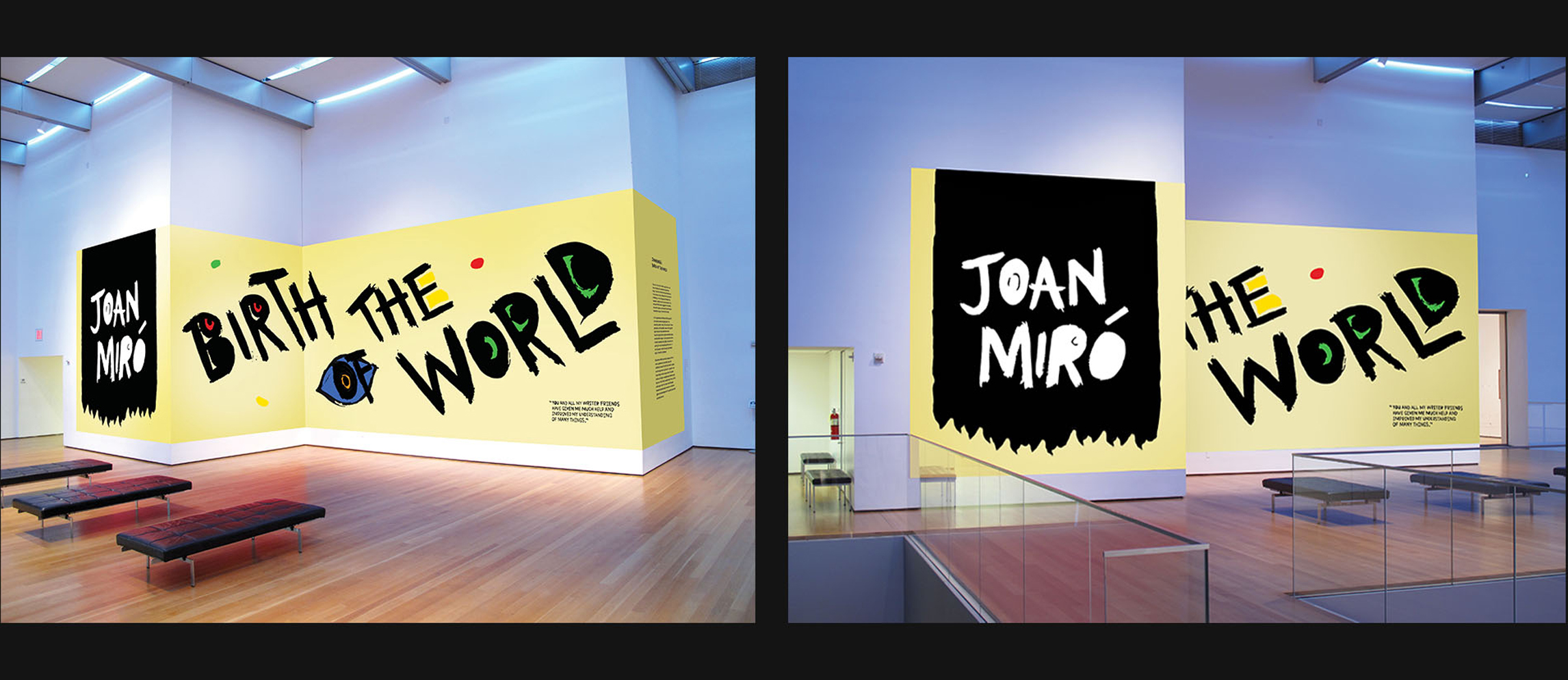
Final wall graphics - variation 3.
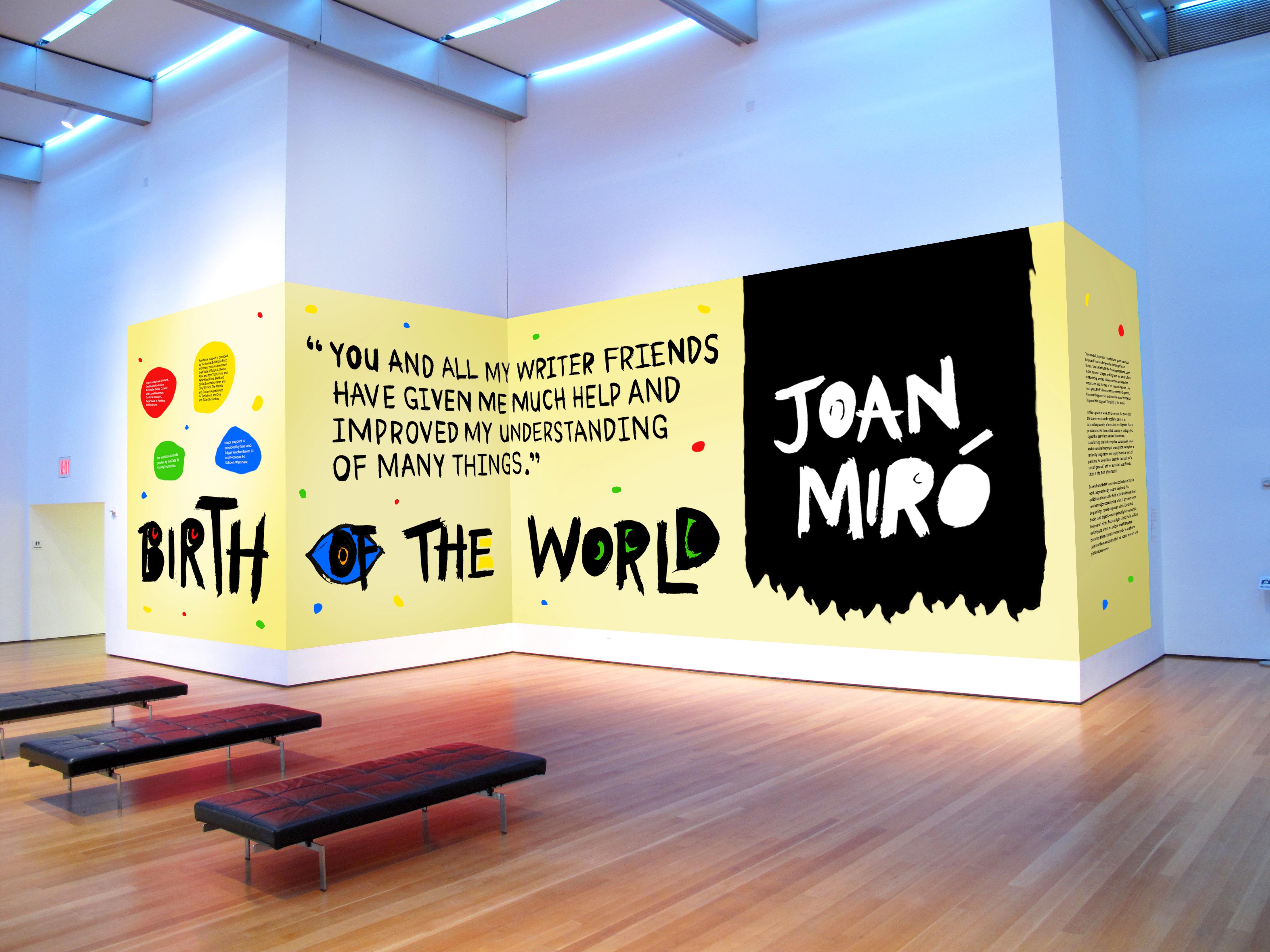
Final wall graphics.
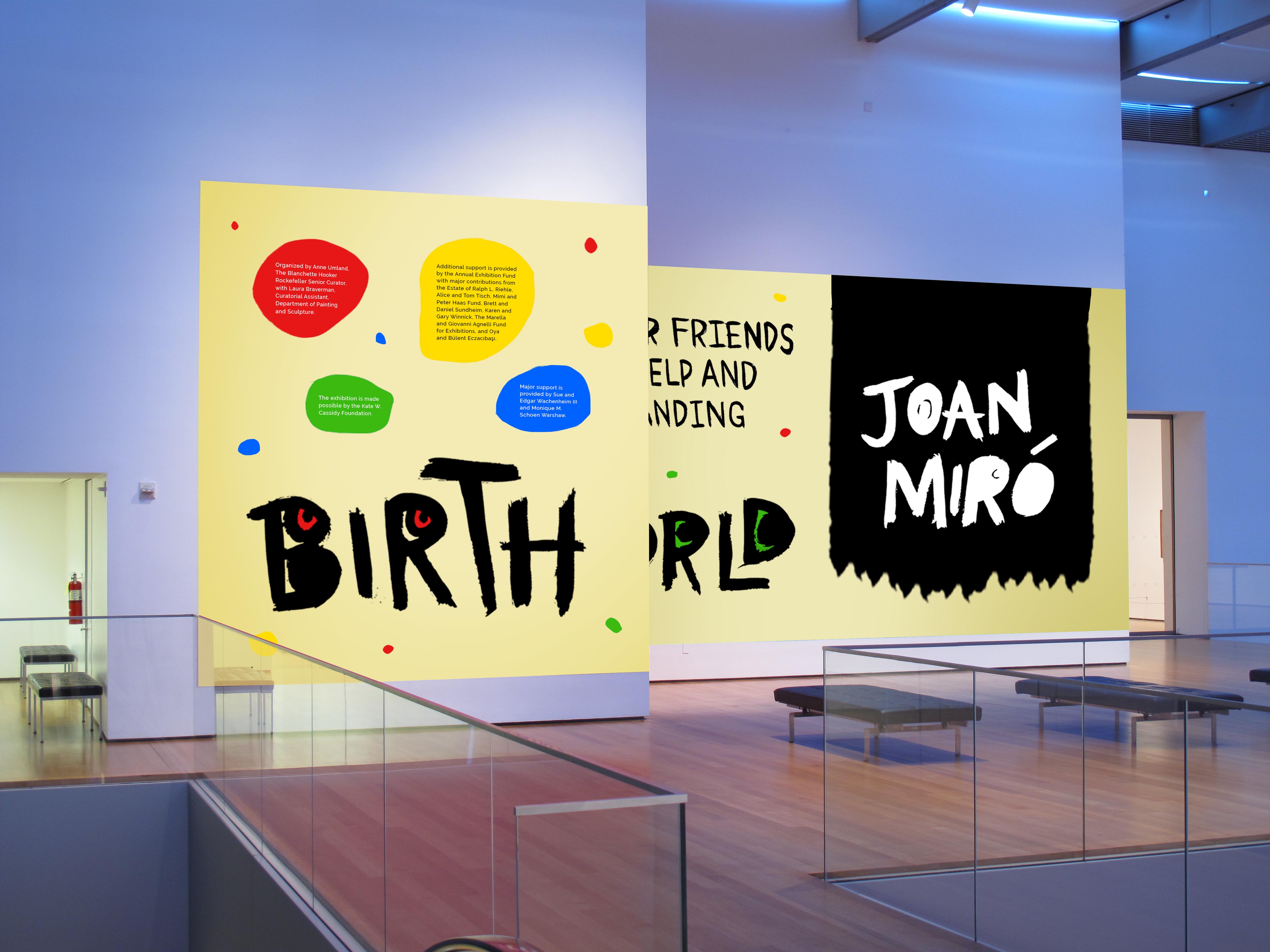
Final wall graphics - left view perspective.
2019 - Rue-Faye Rao - Design